Top accessibility issues in web development
- Authors
- Link
- Alex Noel

- Last updated
Accessibility bugs rarely come from obscure edge cases. They usually come from ordinary web development decisions: a heading that is only a big text block, a custom control that is not a button, a modal that traps users out of its form, an image with no useful alternative text, or a release process that only tests the mouse-based happy path.
These problems show up in hand-coded apps, CMS templates, design-system components, landing pages, ecommerce flows, and low-code tools. And most of those issues look the same regardless of the stack; only the context shifts.
In this article we will go through the most widespread accessibility issue patterns, and then cover what to look for in a visual development platform so those issues are harder to repeat at scale.
A common launch failure
To be more specific, let’s follow through with a simple situation:
- A team wants to soft-launch a new product and needs a campaign page quickly.
- Marketing decides that the best way to do it is to create a landing page.
- A designer or developer builds the page from a reusable template and follows the design spec closely.
- The page is deployed with a subscription form inside a modal that opens on button click.
- Traffic looks healthy for the first few months, even though conversion looks a bit off.
- Then support receives a complaint from a user who cannot even focus the form fields.
The page looked correct in review, and the layout matched the design spec, but accessibility was never part of the workflow. The modal contents were not focusable through tabbing, so keyboard users and screen-reader users could not reach the form fields.
This example is a little bit exaggerated, but it illustrates a common mistake: many teams do not think about accessibility during everyday campaign work, so accessible behavior needs to be built into the development system instead of relying on every publisher to catch every issue manually.
Top accessibility issues in web development
These patterns are common web accessibility problems that become more expensive when they are repeated across components, templates, and pages.
Issue 1: Accessibility checks are missing from QA
QA teams are often focused on functional testing: does the button open the modal, does the form submit, does the page match the design. Accessibility checks ask a different question: can people use the page through keyboard navigation, screen readers, visible focus, sufficient contrast, and reduced-motion preferences?
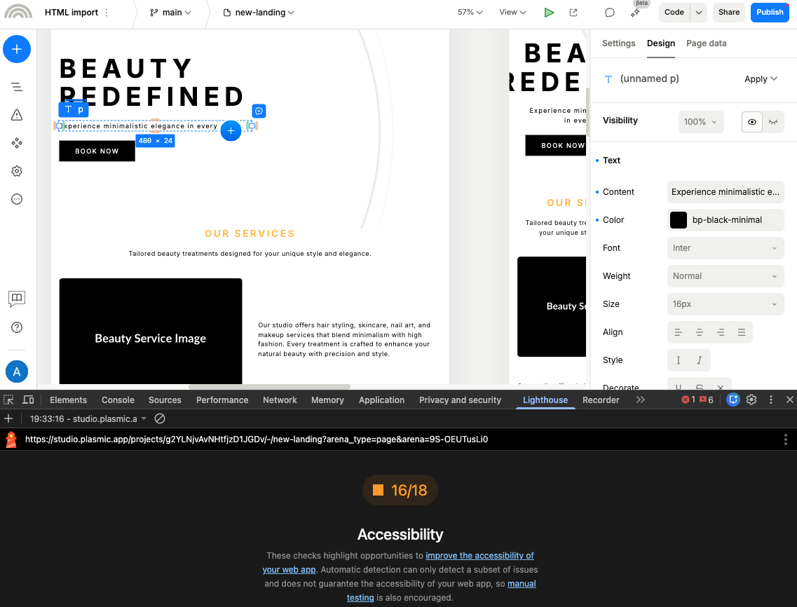
Add a short manual accessibility pass to every production-like review:
- Lighthouse accessibility audit: Run an automated check to catch common issues and get a first list of recommendations.
- Keyboard navigation: Ensure that all interactive elements can be accessed and operated using a keyboard alone.
- Screen reader compatibility: Test important flows with a screen reader, especially forms, navigation, and overlays.
- Color contrast: Verify that text and interactive elements have enough contrast in real page states.
- Focus management: Check that focus is visible and predictable, especially in modals, menus, drawers, and other overlays.
Issue 2: Core components hide inaccessible behavior
Modern websites are built from reusable pieces, and those pieces become accessibility contracts whether the team names them that way or not. A single decision inside a shared button, form field, menu, modal, schema field, or template can improve or degrade accessibility across hundreds of pages.
Common failure modes include components that render clickable div elements, modals without reliable focus behavior, forms without label and error-message hooks, and templates that hide semantic structure behind visual styling.
A practical first check is simple and boring, which is usually a good sign. Open the published page in browser DevTools, inspect one heading block, one CTA, one form field, and one overlay trigger, then confirm role, name, and focus behavior in the accessibility pane. If those basics fail, polishing copy and spacing does not matter yet.
Issue 3: Visual style does not match semantic structure
In any web workflow, it is easy to make text look like a heading by changing its size and weight. The problem is that it may look like a heading on screen but still be plain text in the HTML.
Screen readers use the HTML structure, not the visual style, so users who rely on them end up with a broken or missing outline of the page.
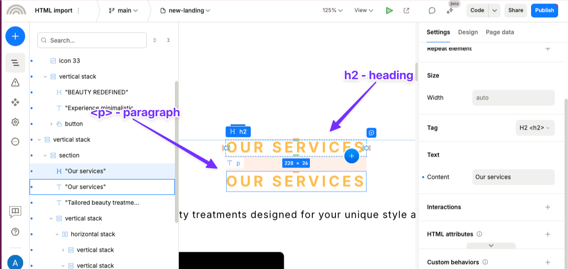
The fix is to build that structure into the components themselves. A title component should have a setting for heading level, and a component that groups related items should use list markup when that is what it represents. A quick check in the browser’s accessibility panel will show whether the structure matches what you intended.
Issue 4: Interactive controls are built from generic boxes
A styled container with a click handler can look complete while still behaving inconsistently across keyboard, assistive technology, and edge cases. Teams usually notice this only after launch because mouse-based QA masks the problem.
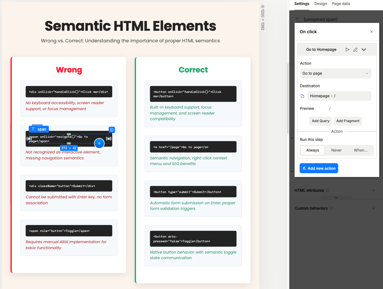
Start from native semantics and build presentation around them, with links for navigation and buttons for in-page actions. That mapping is simple enough to memorize and robust enough to prevent many regressions. When custom composition is necessary, preserve native control semantics at the interaction boundary instead of recreating them by convention.
Issue 5: Content models allow missing labels and alt text
Flexible publishing workflows can lead to inconsistent content structure and labeling if there are no guardrails. This often shows up in CMS-backed pages, reusable sections, and campaign templates where the publisher can change content faster than the team can review every rendered page.
For example, a form schema that does not require field labels or error messages can result in forms that are unusable for screen reader users.
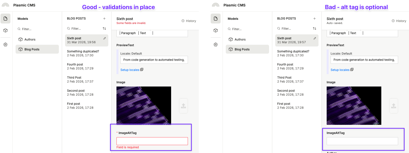
For article or landing-page content, the same idea applies: require image intent and alt text, preserve heading structure, define when one page-level h1 is allowed, and prevent publishers from removing labels that assistive technology relies on.
Issue 6: Responsive layouts break reading and tab order
Layouts can look correct at each breakpoint, but still create inconsistent tab order and reading order. Because DOM order remains the source of truth for keyboard and screen-reader flow, visual rearrangement without semantic review often produces confusing navigation.
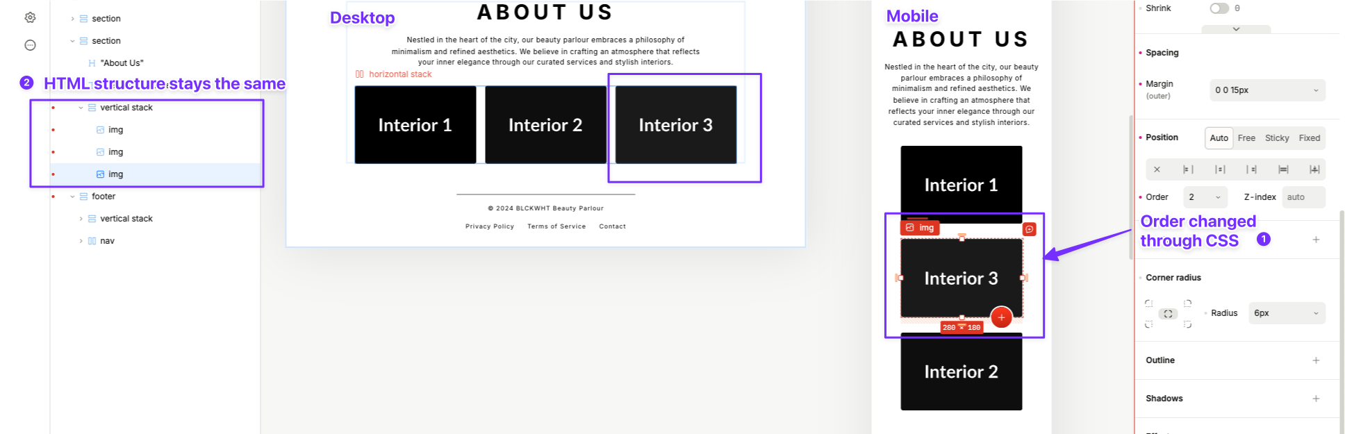
Treat responsive review as interaction review. At each breakpoint, run a full keyboard pass from primary navigation to footer and validate that focus progression matches the intended task sequence. If visual and interaction order diverge, fix the underlying structure first. Use tabindex only for narrow cases where it is truly needed, and avoid positive tabindex values.
Issue 7: Motion and overlays ignore focus and reduced-motion needs
Auto-advancing carousels, delayed reveals, and poorly managed overlays can disorient users and obscure critical actions, especially when focus placement is inconsistent.
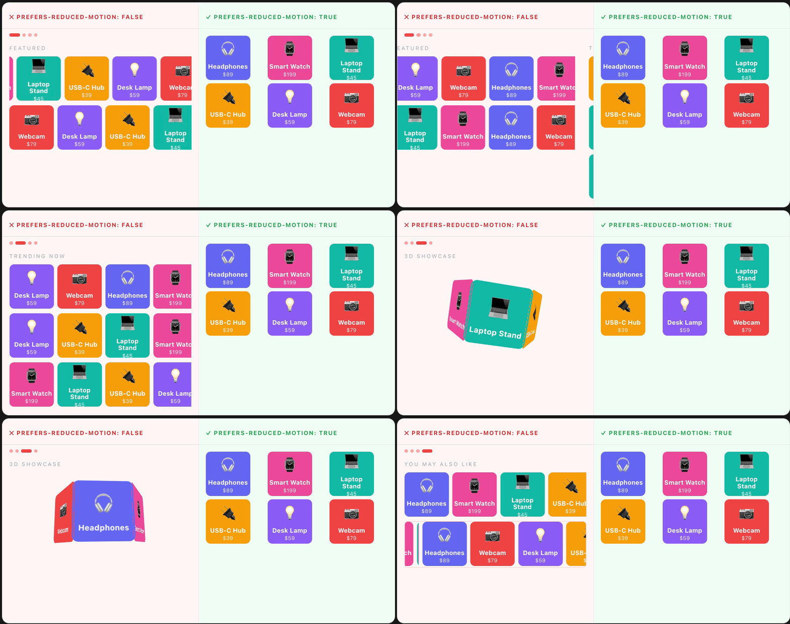
Use motion where it improves comprehension, and ensure equivalent access when motion is reduced or ignored. Test reduced-motion behavior directly and verify that overlays handle focus predictably on open and close.
Issue 8: Third-party embeds bypass component standards
Consent banners, chat widgets, booking embeds, and maps often sit outside first-party component standards, which makes them recurring accessibility hotspots. The vendor boundary does not change user experience accountability.
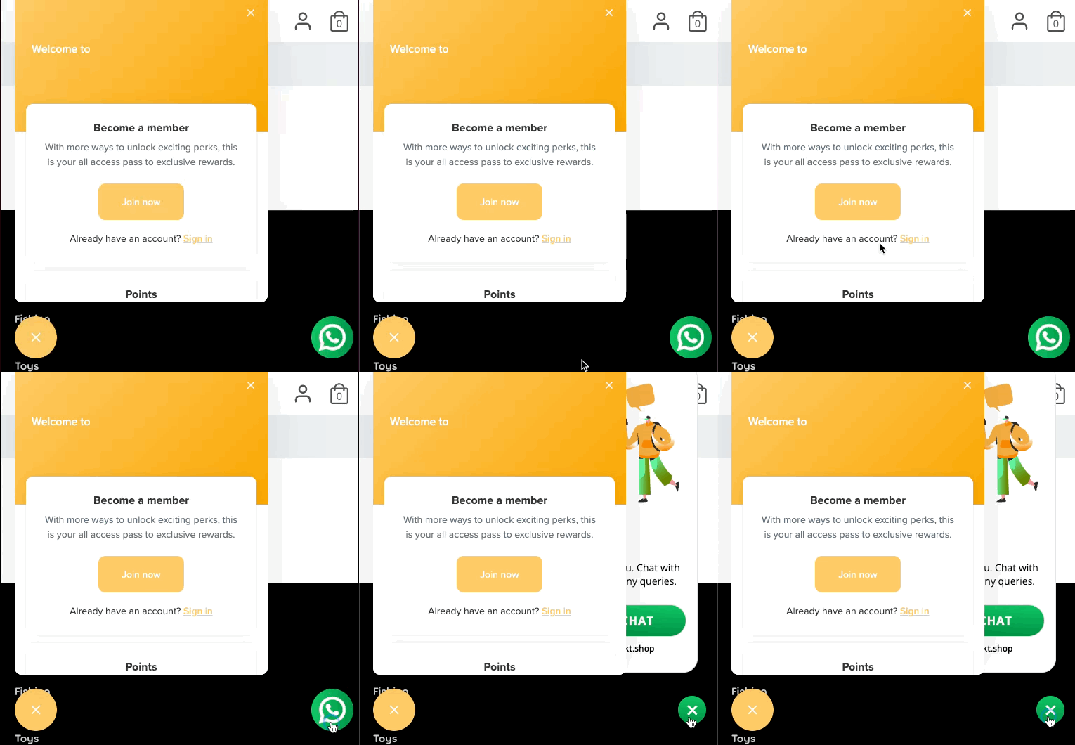
Adopt explicit embed acceptance criteria before launch: keyboard reachability, visible focus, clear labeling, and reliable dismiss behavior. If an embed fails those checks, it should fail release the same way any first-party regression would.
What to look for in a visual development platform
If we managed to convince you that accessibility is important and you noticed a few failure patterns in your own projects, the next question is: how do I pick the right tool? A visual development platform will not magically make a team accessible, but it can make good defaults easier to use and risky patterns harder to publish.
Specific accessibility bugs vary by platform, but the platform evaluation criteria are surprisingly consistent. Before committing to a visual builder or low-code stack, check whether it supports the accessibility work your team will need to do repeatedly:
- Semantic tag controls for headings, text, links, buttons, lists, regions, and form elements.
- Accessible primitives for modals, menus, tabs, accordions, tooltips, forms, and overlays, including keyboard behavior and focus management.
- Editor fields for accessible names, labels, descriptions, error messages, alt text, and ARIA attributes when native semantics are not enough.
- Content-model guardrails that can require labels, image intent, heading structure, and other accessibility metadata before publishing.
- Custom component support so engineers can provide accessible primitives, for example React Aria-backed components, while non-engineers still edit content and variants visually.
- Release checks for keyboard navigation, color contrast, accessible names, heading structure, reduced motion, and third-party embeds.
A weak platform leaves these details hidden in generated markup or scattered across custom scripts. A stronger platform exposes the right controls, ships accessible defaults, and lets teams enforce rules before production.
Workflows for accessible visual development
Now, the final question: how do we actually ship accessibly in a visual development workflow?
These workflows are intentionally short, so that teams have an easy time memorizing and applying them:
Workflow 1: Creating alt text for images
Guiding rule: write alt text for the contribution an image makes to the task on the page.
- Mark the image as informative or decorative.
- For informative images, write concise alt text tied to user context.
- For decorative images, use empty alt and avoid duplicating nearby copy.
Verification check: inspect rendered HTML and confirm the alt attribute matches the selected intent.
Workflow 2: Deciding which heading level to use
Guiding rule: heading level follows structural hierarchy, not visual scale.
- Set each heading to
h1,h2, orh3based on page outline. - Keep one page-level
h1and maintain logical level progression. - Use tokens or variants to style headings without changing semantic level.
Verification check: review heading navigation in an accessibility inspector or screen reader and confirm the outline is coherent.
Workflow 3: Using correct elements for interactive controls
Guiding rule: the element you use is a behavior decision before it is a visual decision.
- Use links for route and anchor navigation.
- Use buttons for submit, toggle, open, close, and other in-page actions.
- Add ARIA only when native semantics do not provide required meaning.
- Do not use
div,span, or other generic containers as interactive controls.
Verification check: activate primary controls by keyboard and confirm behavior and focus feedback are both correct.
Workflow 4: Managing focus visibility
Guiding rule: focus visibility belongs to the system layer, not per-page overrides.
- Define a reusable focus style token for color, thickness, and offset.
- Apply that token to all interactive primitives and custom composites.
- Validate focus visibility on light, dark, and image-backed surfaces.
- Add
tabindexand keyboard handlers only to elements with appropriate semantics, and ensure they are reachable in a logical order.
Verification check: complete a full tab pass on a production-like page and confirm focus stays visible and unambiguous throughout.
What’s next?
Accessibility in visual development is best treated as a system: a shared set of rules, component requirements, content guidelines, and launch checks that teams use before publishing new pages, features, or components.
That system should answer practical questions before they turn into production bugs: how to write alt text, when to use headings and lists, how keyboard focus should move, when tabindex is allowed, when ARIA is necessary, and which accessibility checks must pass before release.
Teams that invest in this kind of system can keep the speed benefits of visual development without turning accessibility into a recurring cleanup project.
The only way to get better at this is to start small and iterate. Pick one of the workflows above, apply it to a new project, and see how it goes. Then expand from there, adding more workflows and refining existing ones based on what you learn!
Follow @plasmicapp on Twitter for the latest updates.