Using Plasmic to build stunning website animations
- Authors
- Link
- Alex Noel

- Last updated
If you work together with a designer as a front-end developer and you need to create an animated section on a website, your typical workflow probably looks something like this:
- The designer creates the static mockup and prototypes how the animations should look like using Figma, or searches for references on the internet.
- It is then shared with the client for approval. After a few iterations, the animation and design are approved and ready for development.
- It gets handed off to you. You approve, knowing that arguing is futile, because it already passed the review with the client…
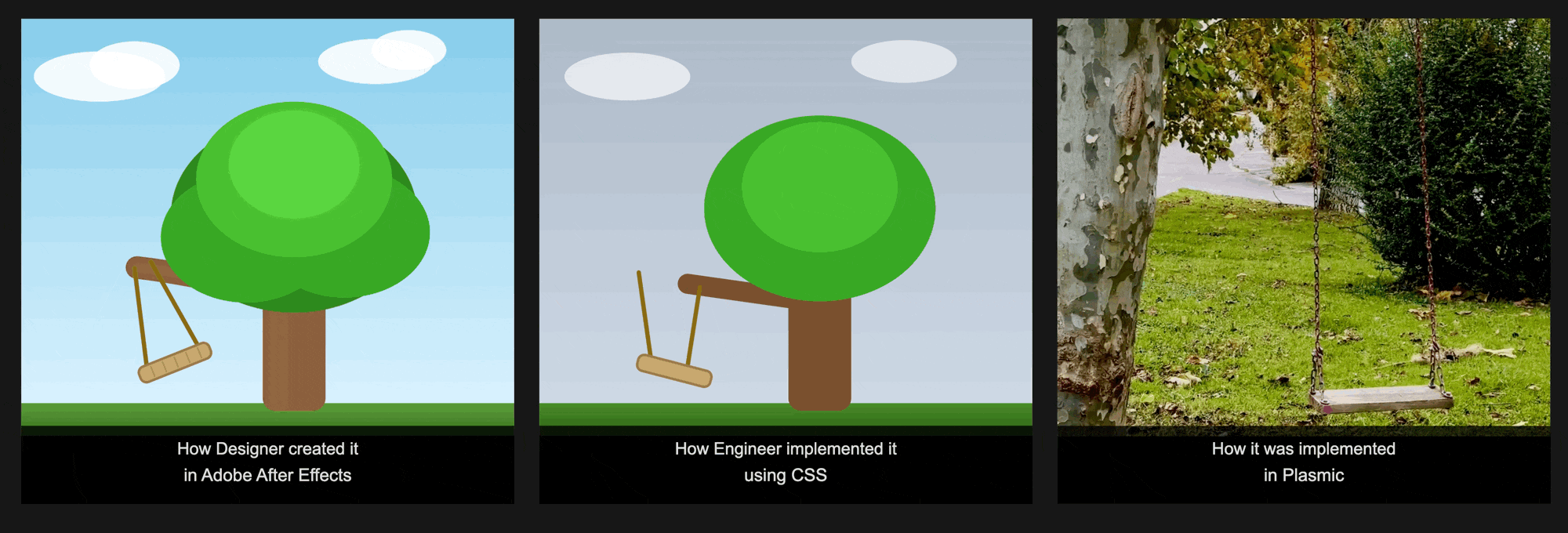
You start to build it, quickly implement the static part — no issues there. Then you look at the animations and realize there’s going to be a ton of back and forth, because most of those are very similar to basic presets (like Fade, Bounce, etc.), but with slight differences that might require dark magic and hacks. You then:
- Look for an animation library, find one that works, create a code component, and register it.
- Wait for the PR review, merge it, deploy it, and once again wait for the designer to review it.
- Repeat this process 10 times until all the animations are approved and look exactly like the design.
Rinse and repeat for every page, every update after launch, and every new feature.
With Plasmic’s new animation feature, you can build custom animations directly in the Studio — without having to maintain and merge code or deal with the handoff friction between you, client, and the designer. And because it outputs plain CSS behind the scenes, your bundle size stays small!
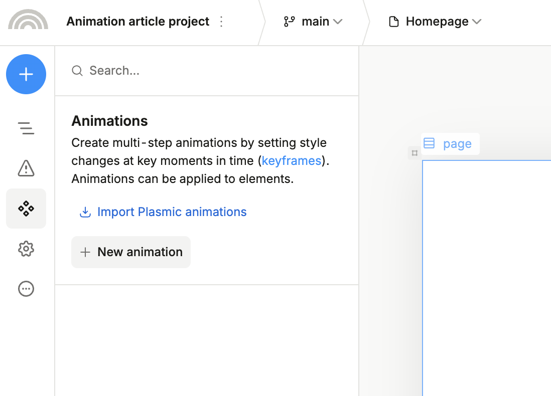
What’s new
Plasmic has supported animations for a while:
- Rive for interaction-heavy animations
- Lottie for After Effects exports
- Using
Embed CSSto store@keyframeanimations. - Registered code components for custom JS/CSS animations.
Which meant that if you wanted to use @keyframes animations, you were back to writing messy CSS in a global embed or registering components.
Now you get a visual timeline editor inside Plasmic Studio. Define keyframes at percentage points - 0%, 50%, 100%, what you need - and set properties for each. The system interpolates between them automatically. Same mental model as CSS @keyframes but zero stylesheet touching required.
What you get:
- Visual timeline editor - Drag keyframes, adjust timing, preview in real time
- Animation presets - Import common patterns (fade in/out, slide transitions) as starting points
- Multiple animations per element - Stack effects with delay controls
- Various triggers - Hook animations to hover states, click handlers, or component variants
- CSS output - Clean
@keyframesrules that render in production
The limitations and rules are straightforward: try to stick to transform and opacity for performance (keep an eye on our upcoming articles, we will go deeper into “why’s” and what are the repaints, reflows, and etc.), and remember that custom component instances need animations applied to their root or a wrapper, not the component instance.
Building something real
Let’s skip the boring button hover tutorial and build something you’ll actually use: a complete micro-interaction system for a save action!
We will create a state indicator that:
- Displays as regular text on top of the form in the base state
- Transforms into a loading spinner when the Submit button is clicked
- Shows a checkmark on success
- Shows an error icon when something goes wrong
Step 1: Create the animations
Open Plasmic Studio and go to the Assets panel. There’s a new “Animations” tab.
Preset animations: Bounce in, Pulse
Let’s first add the default Plasmic animation presets by clicking the Import Plasmic animations button
Then, click “Create Animation” to start building your preset library:
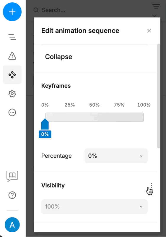
Animation 1: Collapse
This shrinks the button and fades it out, preparing it for the spinner state:
- Keyframe 0%: opacity at 1, scale at 1
- Keyframe 100%: opacity at 0, scale at 0:0:0
Animation 2: Rotate and color alteration
A continuous rotation for the loading indicator, with a slight change to another color:
- Keyframe 0%: Rotate 0deg
- Keyframe 50%: Change the color to light-blue #93C5FD
- Keyframe 100%: Rotate 360deg
Animation 3: Pop
A simple scale-and-fade for the success state:
- Keyframe 0%: Scale 0.5, opacity 0
- Keyframe 50%: Scale 1.1 (slight overshoot for that pop)
- Keyframe 100%: Scale 1, opacity 1
Animation 4: Green color alteration
A continuous change between different tones of green:
- Keyframe 0%: Color #7EFD30
- Keyframe 100%: Color #07D500
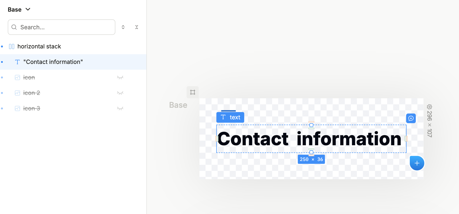
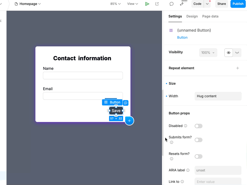
Step 2: Build the component structure
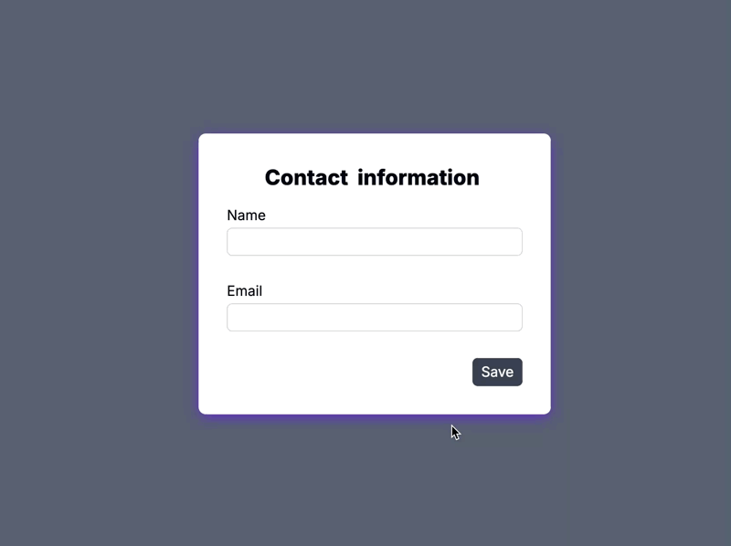
Make a horizontal stack as your button container. Inside it, layer four elements:
- Text label - “Contact information”
- Spinner icon (initially hidden)
- Checkmark icon (initially hidden)
- Cross icon (initially hidden)
Hint: If you also want to add a smooth transition between the element states using opacity: 0 → 1, you would need to account for the positioning. All three elements must be centered within the same space by using absolute positioning within a relative container.
The animations will handle the value transitions regardless of your styles, so you can set any styles you want outside of the ones that we are animating.
Step 3: Apply animations to elements
Plasmic’s variant system makes this easy. We’ll create four variants:
- Default - Normal state, showing text
- Loading - spinning indicator with altering color
- Success - popping checkmark with green color alteration
- Error - bounce in with pulse animation
In the right sidebar, click “Variants” and add these four. For each variant, we’ll apply different animation presets and visibility settings.
Default Variant:
- No animation applied
- Text visible
- All other elements hidden
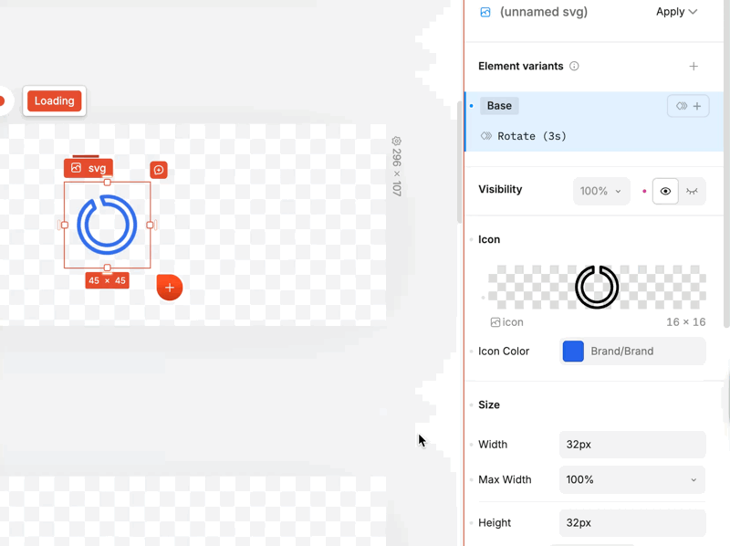
Loading Variant:
Spinner visible with “Rotate” animation applied
- Duration - 3s
- Easing - linear
- Iteration count - infinite
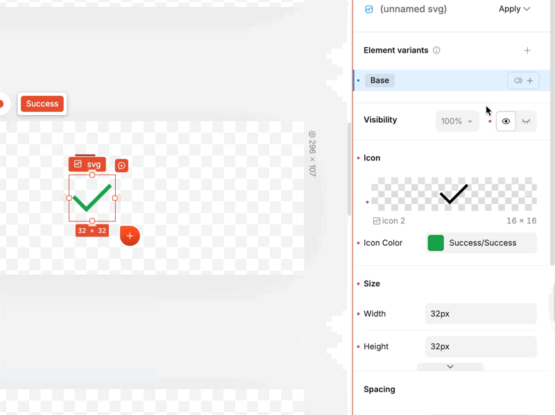
Success Variant:
Add “Pop” and “Green Color” animations to the checkmark element with the following params:
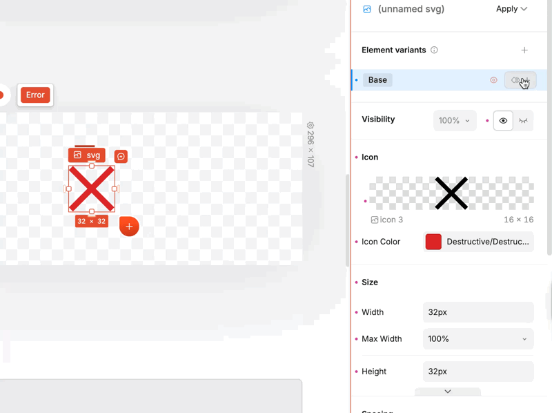
Error Variant:
Search for “[PlasmicKit] Animations” section and add the Bounce In and Pulse animations with the following params:
Step 4: Handle the interactions
Time for the logic. Plasmic lets you trigger variant changes based on component state. For this demo, we’re using a simple state machine: clicking the button moves from Default → Loading, and after a fake delay, it transitions to Success
In production, you’d wire this to your actual save function - the variant transitions would trigger based on when the promise resolves using the “Run this step” logic to check for error from the previous step.
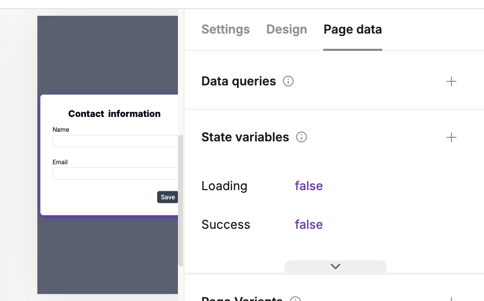
Go to the page with the form, switch to Page data tab in the right sidebar, and create the following State variables:
- Loading - boolean, default
false - Success - boolean, default
false - Error - text, default empty
Set up the interactions:
- On Click: Set state
$state.loadingtotrue
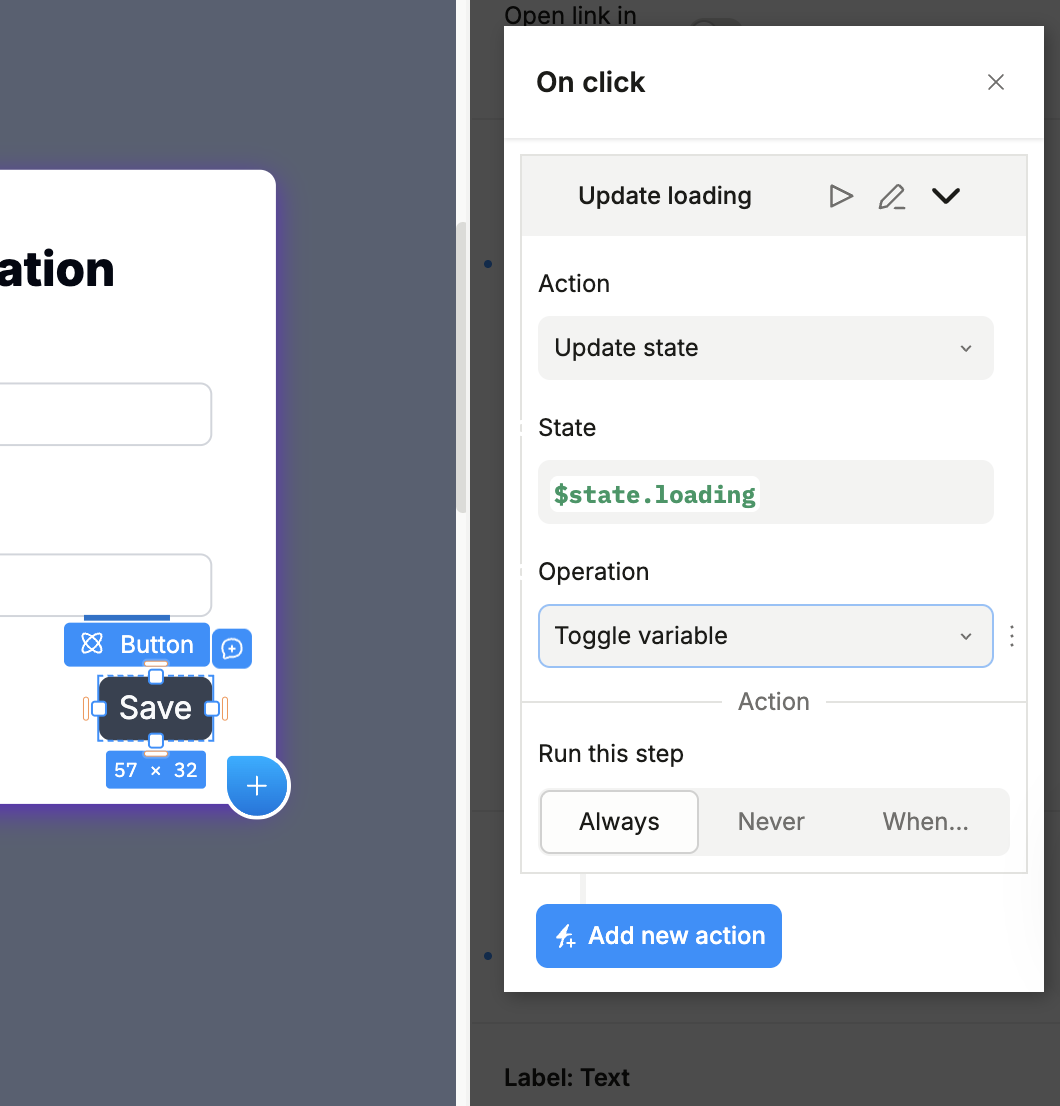
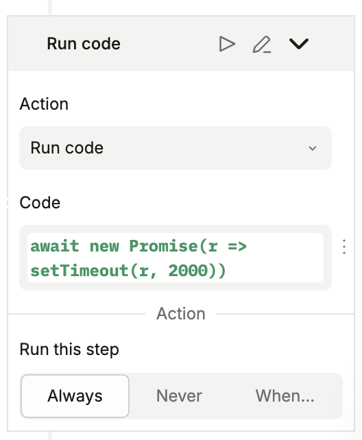
- Run Delay 2000ms:
Run the following code: await new Promise(r => setTimeout(r, 2000));
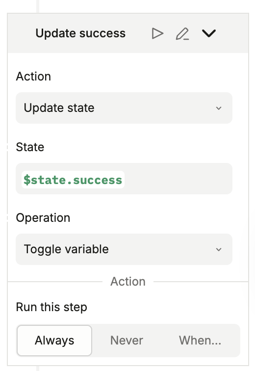
- After Delay: Set
successtotrueandloadingtofalse(same action as in step 1)
Now all we need to do is connect the state variables to the variants.
Step 5: Connecting state to variants
Variants are simply controls, meaning we can use dynamic values to determine whether they are enabled or disabled. Let’s connect each variant to its relative state value, and connect the Disabled state of the button when the form is loading:
Step 6: Test and Refine
Open the preview mode and click the button. Watch for:
- Immediate visual feedback on click
- Smoothness of animations, loading indicator color alterations
- Success confirmation appears in time
- Button is not clickable when form loads
If the animation feels too fast or too slow, tweak the timing in the Animation panel. If the spinner rotation looks choppy, check that you’re animating transform: rotate and not something else. Browsers optimize transform animations better than anything.
Heads up: rapid clicking during transitions can trigger overlapping animations. In production, you’d disable the button during loading/success/error states. Add “disabled” prop tied to your current variant.
The Generated CSS
Behind the scenes, Plasmic generates clean CSS. No additional JS animation libraries - just good old keyframes that run at 60fps. For our Collapse animation, you’d see something like this:
@keyframes collapse {
  0% {
    opacity: 1;
  }
  100% {
    opacity: 0;
    transform: scale(0);
  }
}
Where This Gets Interesting
The save indicator example is useful and all, but the real power comes from combining the advanced techniques:
- Chain animations — fade out one element while another slides in
- Stagger delays — animate a list of items with sequential timing
- Trigger on scroll — use Plasmic’s scroll variants to start animations when elements scroll into view
- Combine with other approaches — use keyframe animations for simple UI feedback, reserve Lottie or Rive for complex illustrations
The Plasmic team has an example project that shows these patterns: https://studio.plasmic.app/projects/9UaP9kr5mbh93WnkGehj7x.
It includes:
- sunset/sunrise toggle that animates a sun’s position based on switch state
- a drawer menu with smooth open/close transitions
- several hover effect variations
Try It Yourself
You can find more examples in our documentation - feel free to clone them, break, and rebuild as many times as you’d like. The best way to learn animations is to experiment with timing, easing, and keyframe sequences.
Start with something small - a hover effect, a toggle animation. Once you see how it all works, you’ll find opportunities everywhere. Every button click, every state transition, every loading moment is a chance to improve the UX.
You might’ve noticed that we intentionally missed the setup for the error state in the example above. Try to implement it yourself - it’s a great way to practice!
If you’re looking for more inspiration, check out our animations documentation for detailed guides and examples.
Follow @plasmicapp on Twitter for the latest updates.