Repaints, reflows, and animation performance explained
- Authors
- Link
- Alex Noel

- Last updated
We recently launched Plasmic Animations, a new feature that allows you to ship native CSS animations without writing every @keyframes block by hand. If you have not tried it yet, it is definitely worth exploring.
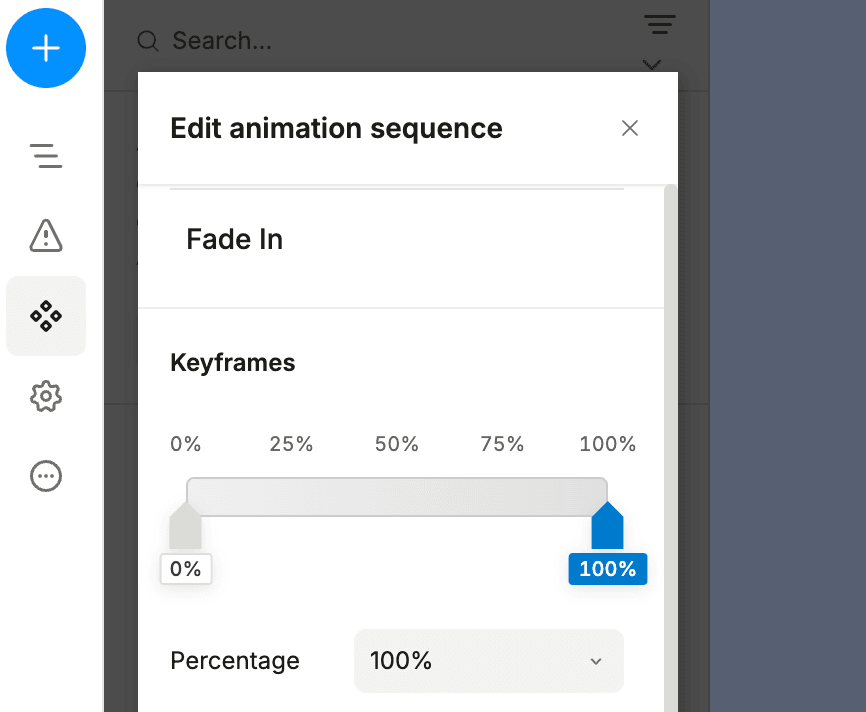
This feature can speed up your workflow, though to use it fluently, you will need to learn some rendering fundamentals. No need to become a senior front-end developer - it’s enough to understand basics of how animations are rendered, what the browser struggles with, and where the no-go zones are.
After all, if you are to design a comfortable chair, you should know the materials it can be made of and some of their strengths and weaknesses, right?
So we thought it’d be a good idea to explain to you how animations work behind the scenes!
Optionally, you can also check out our animations documentation to have an even better understanding of how to create animations the no-code way.
tl;dr
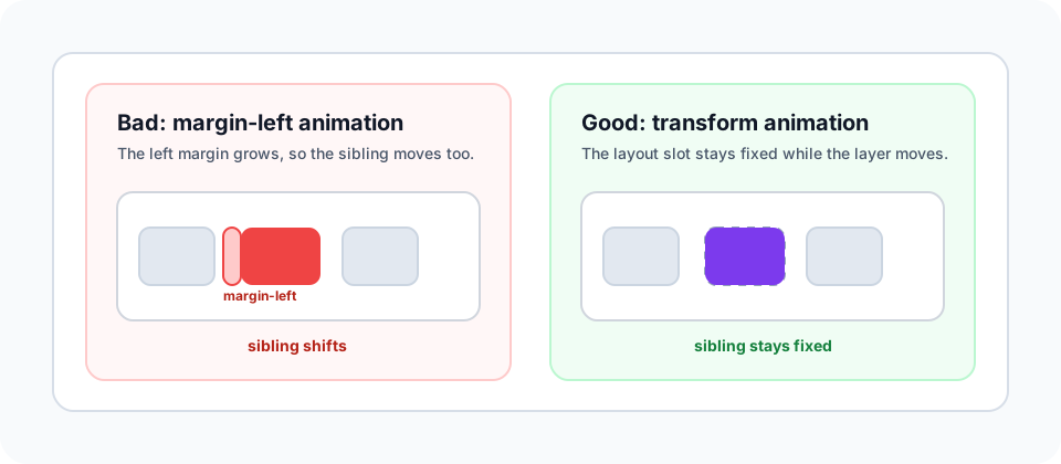
For most UI animations in web, not just Plasmic:
- Use
transformfor movement, scaling, rotation, etc. - Use
opacityinstead ofdisplayfor hiding elements where possible. - Be careful with
filter,clip-path, and shadows. They can cost more than they look. - Avoid animating
width,height,top,left,right,bottom,margin,padding, grid/flex sizing, or text sizing unless you have a strong reason to do so. - If one element must move and rotate, put both values into the same
transformkeyframe. Do not create two separate animations that both try to controltransform, as you might get confused about which one wins.
The reason is the browser’s rendering pipeline, and how CSS works in general:
Pixel pipeline
To render a page your browser needs to turn CSS and HTML into pixels. This process is happening in a series of steps, each having a different calculation cost. Different browsers use different internal names, but this model is enough for animation work:
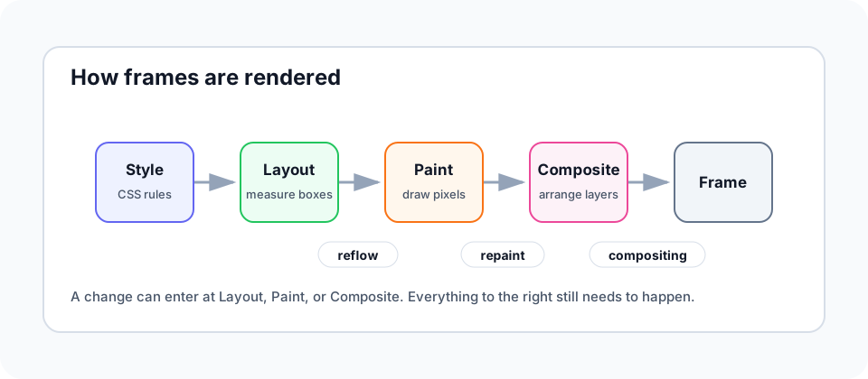
Here is what each step means.
- Style: The browser decides which CSS rules apply.
- Layout: The browser measures elements, their position, and how elements affect other elements on a page.
- Paint: The browser draws pixels for each element, including colors, shadows, text, etc.
- Composite: The browser puts painted layers together and shows the final frame.
Each step can force the next step to run again, but browsers try to minimize that by skipping unnecessary work, see image above for reference
- If the browser needs to measure an element or its neighbors again, that is usually called reflow.
- If it needs to redraw pixels without changing layout, that is repaint.
- If it can move or blend an already-painted layer, that is compositing.
That gives you a practical way to reason about CSS properties:
| If a keyframe changes… | The browser usually starts at… | Examples |
|---|---|---|
| Element geometry or document flow | Layout | width, height, top, left, margin, padding, grid/flex sizing |
| Pixels inside the same box | Paint | background-color, color, border-color, box-shadow |
| How an already-painted layer is placed or blended | Composite | transform, opacity |
So transform and opacity are your safest bets, because they just change how the already-painted layer is shown on screen, and are therefore less likely to drop frames.
In general, knowing where a property enters the pipeline explains why transform: translateX(...) is usually cheaper than changing left. Let’s actually try to see that in action!
Example: using transform vs position
Imagine you want a drawer menu to slide in from the left.
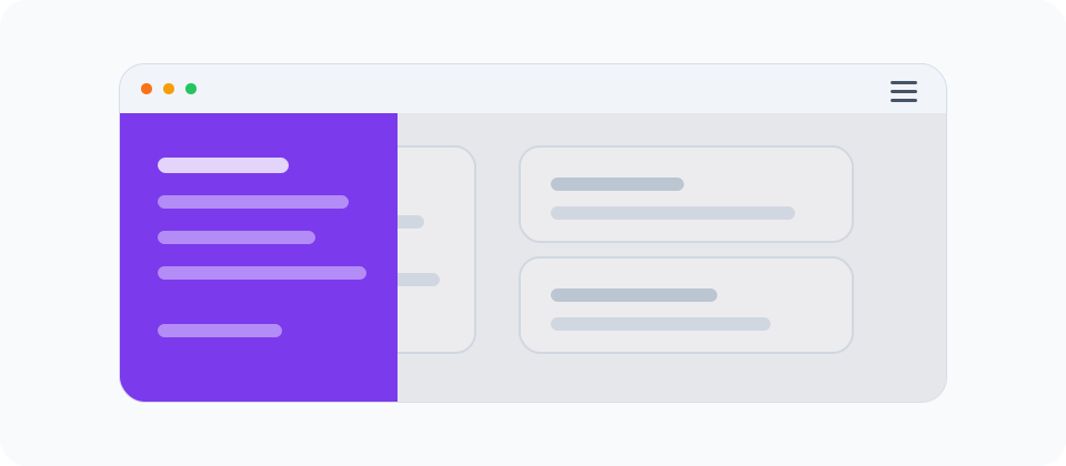
These two versions look similar on screen but create different browser work.
First version animates left:
.drawer {
  position: fixed;
  left: -320px;
  transition: left 250ms ease;
}

.drawer[data-open='true'] {
  left: 0;
}
The drawer moves, but left is a layout-related property. The browser has to treat this as a geometry change, run layout again, then continue through paint and composite.
Second version animates using transform:
.drawer {
  transform: translateX(-100%);
  transition: transform 250ms ease;
}

.drawer[data-open='true'] {
  transform: translateX(0);
}
Try to reproduce the same thing in Plasmic:
- Style your menu, hide it with
transform: translateX(-100%)initially. - Set the
transitionproperty. - Create an
openvariant that changes thetransformtotranslateX(0). - Switch between variants using an interaction on a button or icon.
And then do the same thing with left instead of transform. You should see that the transform version is smoother and less likely to drop frames because it starts later in the pipeline.
Layout boxes and visual layers
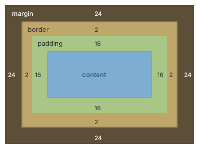
A DOM element is not just the pixels you see. During layout, the browser creates a layout box for it: the physical slot the element owns in the page.
That slot has concrete layout properties:
- Geometric bounds:
width,height,padding, andborder. - Layout position: the
xandyposition of the box in the document or positioning context. - Margin box: the outer perimeter that controls spacing from nearby elements.
- Formatting context: whether the element behaves like a block, inline element, flex item, grid item, fixed element, etc.
Even when an element is position: absolute or position: fixed, properties like left, top, right, bottom, width, and height still describe that layout box.
That means changing left usually will not push sibling elements around when the drawer is fixed, but the element’s own slot still moved. The browser has to update layout geometry for that element, then continue through paint and composite.
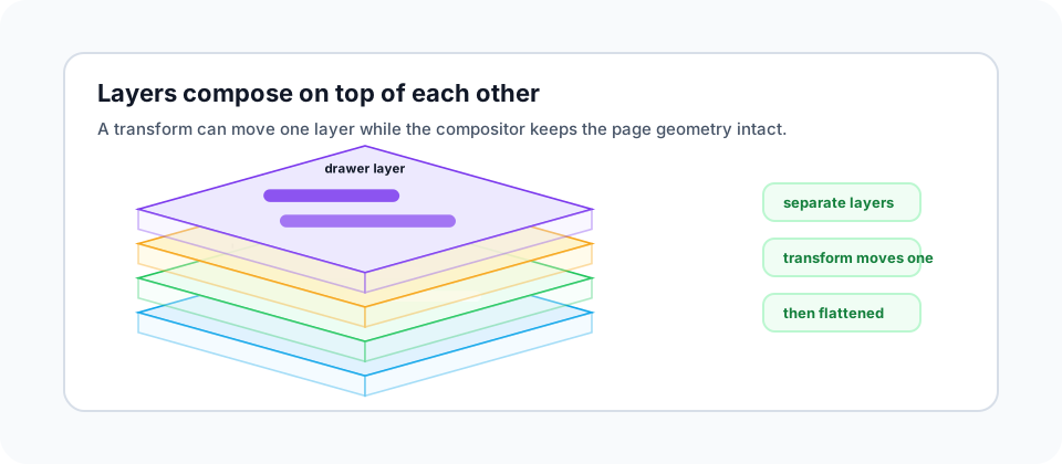
transform is different because it separates the slot from the pixels. The layout box stays behind in its original measured position, still owning its width, height, margin, and layout behavior. You can think of it as a geometry ghost that keeps the page structure stable.
The visual pixels are then moved as a separate layer. If you transform a drawer 320px to the right, it can visually cover the page content, but it does not push that content away. The browser can often move that layer in the compositor instead of recalculating layout and repainting every frame.
will-change can help when you know a transform or opacity animation is about to run, because it lets the browser prepare the layer ahead of time. Use it sparingly and remove it when the animation is no longer likely; too many promoted layers can waste memory.
Which properties should you animate?
The rule is quite simple: try to avoid layout changes in every animation frame. Always ask if the same effect can be built with transform or opacity, even if you need one extra wrapper element to do it.
You can still animate some of the geometry properties like width and height in small doses. This is usually fine if the element has position: absolute or position: fixed - this will limit the impact on surrounding layout. But try to avoid animating these properties on elements that are part of a layout flow, like position: relative or position: static. This will cause reflow and repaint, which is expensive.
How animations can hurt website performance
Layout-heavy animations that drop frames can:
- Compete with hydration and other JavaScript work on the main thread.
- Make scrolling feel stuck.
- Delay response to taps and clicks.
On top of that, the heavy animations can also:
- Cause layout shift if elements push other content around.
- Burn battery on mobile devices.
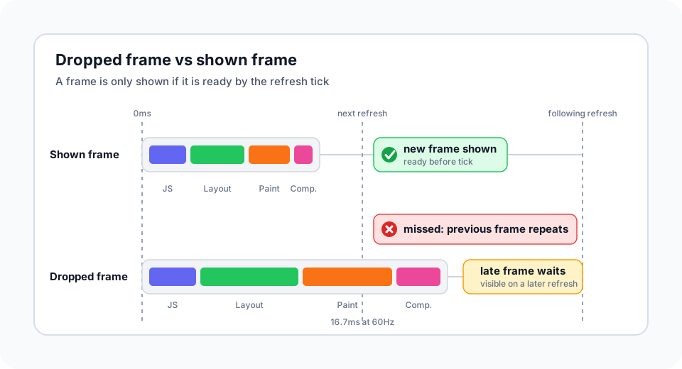
A dropped frame does not mean the browser shows half-finished pixels. It means the new frame was not ready when the screen refreshed, so the browser kept showing the previous frame for one more refresh.
How to test
In Chrome DevTools:
- Use the Performance panel and record while the animation runs.
- Look for Layout and Paint work during the animation.
- Enable FPS meter to watch dropped frames.
- Enable paint flashing to see what is being repainted.
- Use Lighthouse to catch non-composited animations.
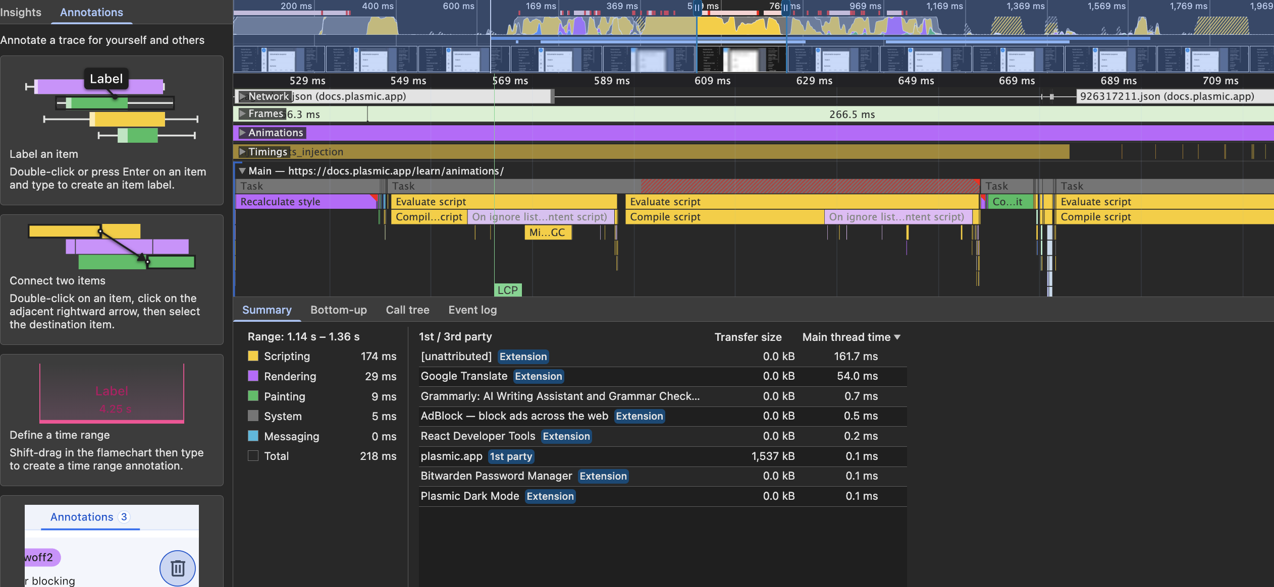
In Firefox DevTools, the Performance waterfall can show style recalculation, layout, and paint work as well.
Next steps
If you are just starting, read the Plasmic animations docs. Or skip it and go straight ahead to the Plasmic Studio to learn while building!
Feel free to share the cool stuff you create with us on Slack, Forum or X - we’d love to see what you create!
Follow @plasmicapp on Twitter for the latest updates.