Tour of the TodoMVC project (UI builder tutorials)
This is about using Plasmic as a UI builder—a more rare and advanced mode of using Plasmic! Users more commonly want to use Plasmic as an app builder.
This is a brief tour of what’s in the TodoMVC Plasmic project. We use this to also introduce some basic concepts in Plasmic and explain how the app is modeled using these concepts. This is written for all new users to Plasmic, whether designer or developer.
TodoMVC is a standard introductory app, so this project recreates the same design. You can play with example implementations of the app at todomvc.com.
Make a copy of your TodoMVC Plasmic Project
The example TodoMVC Project is here. Visit that page, and you will see a notification that you only have read-only access, but can make a copy of the project. Go ahead and do so, so you can play with your own copy as you follow along.
Artboards and Arenas
A Plasmic project consists of designs of components, which are reusable parts of the product being designed. These can be small (like buttons) or large (like entire screens).
When you open up the project, you’ll see a bunch of artboards laid out showing the various components. The space they’re placed in is the arena (“page” in other design tools).

A project can have multiple arenas, and you can bring up the arena switcher in the top left of the studio UI. You can rename the arena by double clicking the name.

The second arena has a bunch of artboards set up to show the app in its dark mode theme. We will talk about this in detail later in this document.

TodoApp component
Back in the Light Mode arena, you should see the TodoApp component. This is the main screen of the app. It consists of a header for inputting a new task, a list of tasks, and a footer to toggle what tasks to view in the list. Take a look at the structure of the UI outlined in the left tree.

The list is a vertical stack, tasks-container, that hardcodes four tasks. These are instances of the Task component, each one set to a different variant—states that the component can be in. For instance, the second one is in the editing state, and the third one is in the completed state (the others are in the normal or base variant). We’re just showing them in different variants to illustrate the different states they can be in.
Notice the Task instances have different text. Task is an example of a component that has a slot—a “hole” in the component for instances to fill in with content. Think of a Button component that has a slot for the button’s text—that way one Button instance can read “OK” and the other “Cancel.” This is accomplished using overrides in other design tools, but in Plasmic the component author designates what parts are allowed to be overridden. Here, the Task component has a slot for the description text.
The Header and Footer are also separate components—the TodoApp component contains an instance of each.
The entire TodoApp main screen itself also has a second variant. So far we’ve been looking at the base variant. All components always have a base variant—this is often the normal or typical appearance of the component. But the TodoApp has an “empty state” variant. Notice that when there are no tasks, we don’t show any footer—that’s the main difference.
You can bring up the Component Panel by clicking anywhere in the relevant artboard, and select any variant to see what it looks like. Note that when a component variant is selected, when you make changes, your changes will be specific to that variant.

Header component
To the right of the TodoApp artboard, at the top you’ll see the Header component in its own artboard.
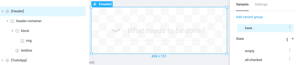
It has a few different variants that you can switch between. There’s the base variant, and also the “empty state” variant and “all-checked state” variant. These two other variants are in a variant group called “State.” All variants are organized into groups, which are typically single-choice groups—only one variant in it can be active at a time. For instance, a Button component might have a Color variant group with Red and Blue variants, along with a Size variant group with Small and Large variants.
Here the State variant group lets you activate either “empty” or “all-checked” but not both. You can click them to switch what is shown to the different variants:


Task component
Below the Header, you’ll see two artboards for the Task component. How can there be two of this component, and why do they look different? You can think of artboards as views of a component—you can have as many views as you want, and you can even have them side by side showing the component in different variants. That’s the case here. The top artboard shows the base variant for Task, and the bottom artboard shows the “editing state” variant for Task.

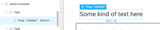
The base variant simply displays the empty (unchecked) circular checkbox and the description of the task. The description is a slot—which again is a “hole” in the component for instances to fill in with content. Slots have default content, and here that’s “Some kind of text here.” Instances that fill in their own content are overriding this default. Notice also that the slot’s name is “children” (components can have multiple slots).

In the “editing state” variant, the description text is hidden and instead an editable textbox is shown (with some inset shadow). Compare the left trees in these two variants, and notice how the elements that are marked invisible (with the crossed-eye icon) are flipped; we show the editing-related elements in the “editing state” and hide the other elements, and vice versa.


Footer component
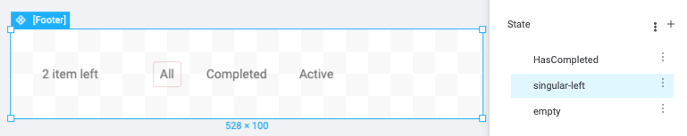
The Footer features a task count and a row of ToggleButton instances, where one of the buttons is “selected.”

It also has variants for:
- the state where completed tasks exist, so the “Clear Completed” button is shown
- the state where only one task is left, so “items” changes to “item”
- the empty state, where we hide the count


ToggleButton component
Lastly, we come to the ToggleButton. Besides the base variant which depicts what the button should look like when it’s unselected, we have the hover variant and selected variant.


The Hover variant is a special type of variant, called an interaction variant. These are available for a few special states that the component can be in—if it’s hovered, pressed, or focused. Or any combination of these, if for instance you want a specific look when the button is both hovered and focused at the same time.
Interaction variants are always nested under another variant, hence why you see that nesting in the variant switcher. This is because you may want for instance a different hover effect for different variants—e.g. a Button’s Blue variant might have a bluish hover color while a Button’s Red variant might have a reddish hover color.
Assets
Projects consist of more than just components—another important building block of designs and design systems is the style token.
Plasmic currently supports color tokens. Under the left Assets tab, you should first see a list of all the color tokens in the project.

The various elements that make up the UI reference these color tokens rather than directly specifying a raw color value, which ensures consistent use of color throughout the design.
Below style tokens, you can see the list of style presets, which are essentially reusable bundles of style settings. Whereas a color token is a simple value like “#0070a0,” and doesn’t care whether it’s used as a background color or text color, a style preset might specify that the background color should be “#0070a0,” and also that a certain drop shadow should be used and the content should be centered. Basically, anything that you can set in the right sidebar can be moved into a reusable style preset.

Dark mode
Now let’s take a trip to the dark side! Switch to the second arena and click into the TodoApp component.
Note that this is the exact same component as the TodoApp component in the first arena; we’re simply looking at a different variant.
This is an example of a global variant. A global variant is not specific to any component, but global to the entire design project. Dark mode is a great example of a global variant, because you may well want all your components to look different whenever it’s activated. Other use cases for global variants include platform (you may want many components to look different between iOS and Android), screen size (for responsive design), and so on. Plasmic creates a Screen global variant group for you that you can use to create responsive design. You may create other global variant groups as you need.
Further learning
This tour introduces some core concepts and focuses on how to navigate a project, but for a more in-depth understanding of the concepts and for learning how to craft designs, see the components.
If you’re interested in seeing how Plasmic can generate code for this UI to build a real app, please see the Plasmic Developer Tutorial.
Feel free to check out other Plasmic Example Projects as well. Happy exploring!
Back to Learn Plasmic.
Have feedback on this page? Let us know on our forum.