Understanding Layouts in Plasmic
- Authors
- Link
- Alex Noel

- Last updated
Layouts define how items are positioned on a screen. Plasmic uses the idea of boxes to organize and position items on a webpage. These boxes are nested within each other to create beautiful designs that make up your project UI. Let’s take a closer look at the different types of layouts we have in Plasmic and how you can use them.
Stacks
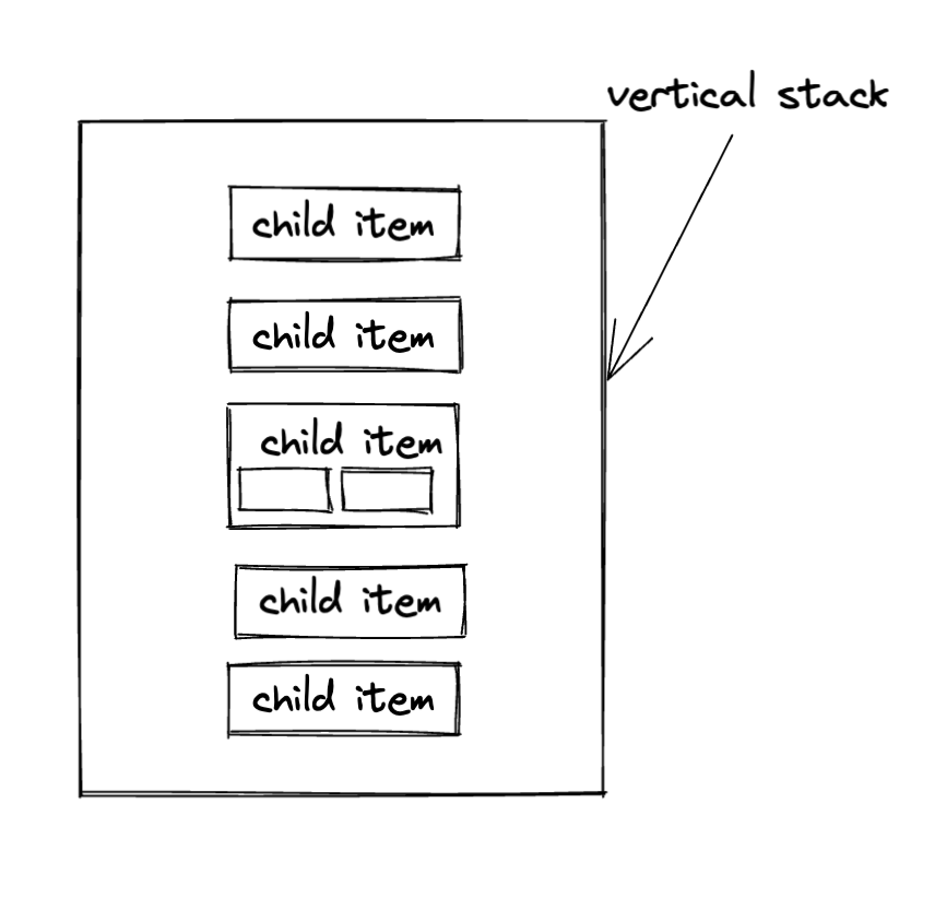
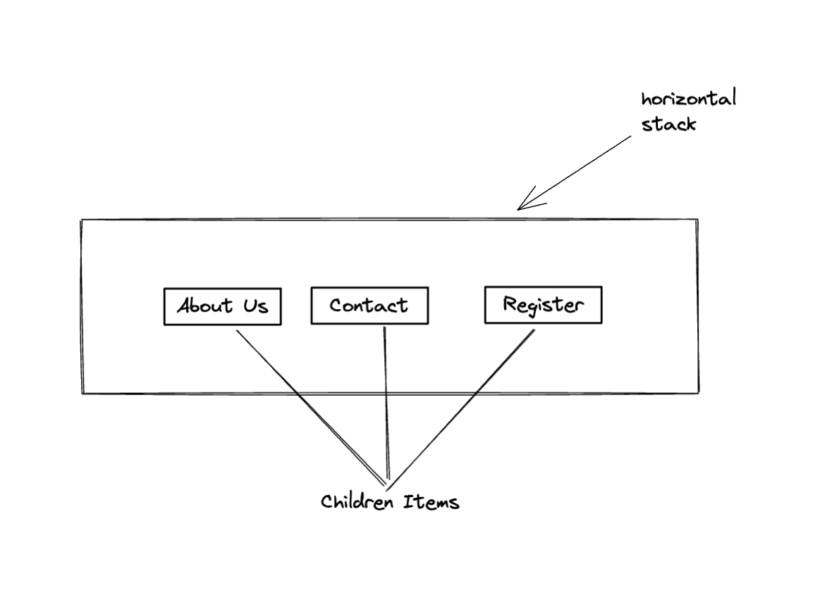
The most basic layout elements in Plasmic are the vertical stack and the horizontal stack. They provide a very intuitive way of positioning items on the screen that make them easy to use and understand.
Vertical stacks are quite self-explanatory — they are layouts that stack it’s children items vertically on top of each other, like a column in a spreadsheet. The items in a vertical stack are positioned from the top of the stack to the bottom. If you’re tech savvy — it would be enough to know that under the hood vertical stacks are mostly flexboxes with flex-direction: column. Here’s an example of a vertical stack:
Horizontal stack in Plasmic is a layout element that stack it’s children elements horizontally beside each other, so you can think of it as a row. The items in a horizontal stack are positioned from the left of the stack to the right. Alternatively, you can think of it as the same flexbox element as a vertical stack, but with flex-direction: row. Here’s a visual representation of a horizontal stack with some children items:
Grid
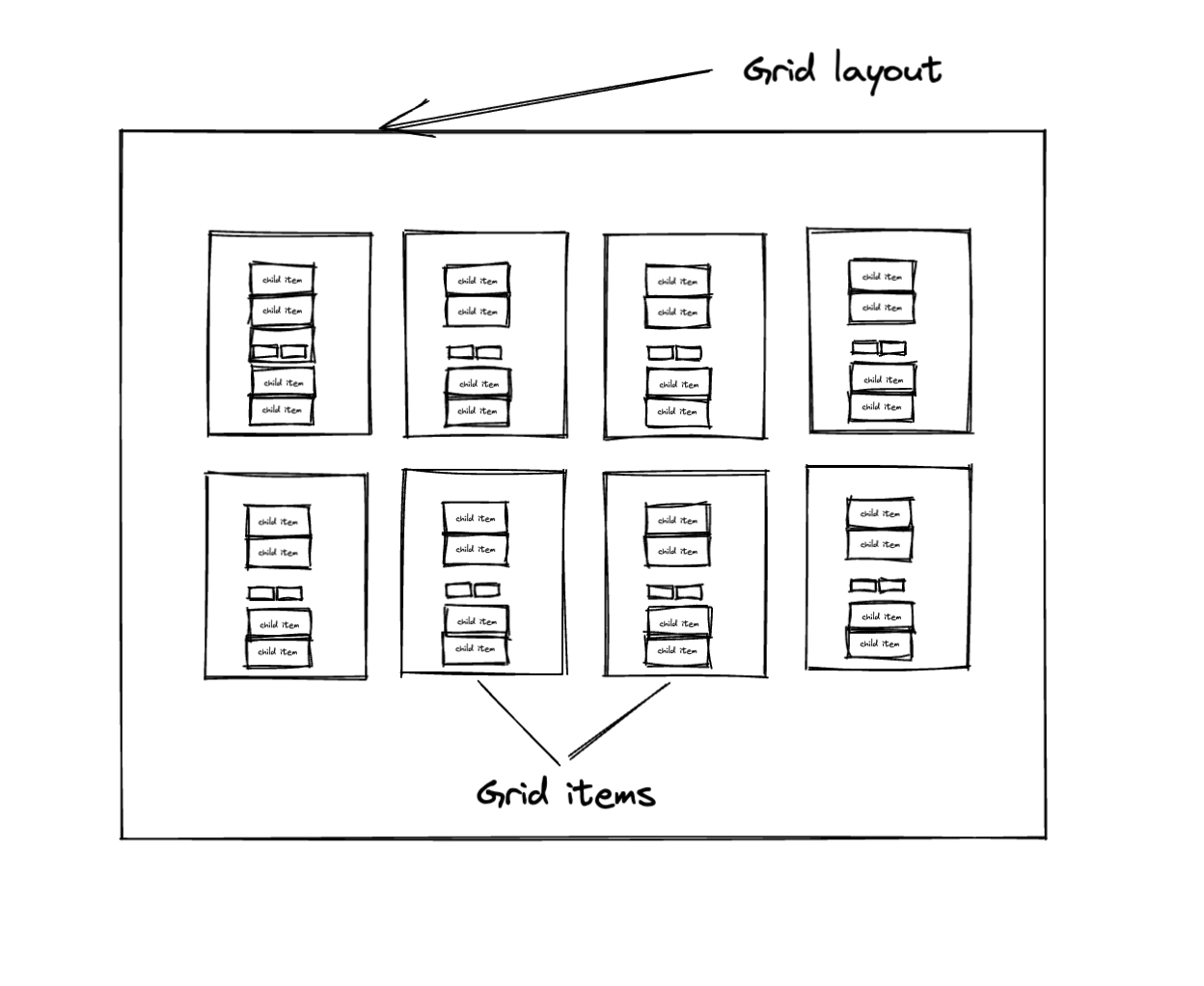
Grid layouts make it possible for you to create gallery-like experiences. One of the benefits of using the grid layout in Plasmic is that you can create a collection of items that are laid out in a repetitive pattern.
It is primarily used for displaying a collection of images or other types of content that you want to display in a gallery-like fashion ex: (listing products, team members, blog posts, etc).
Responsive columns
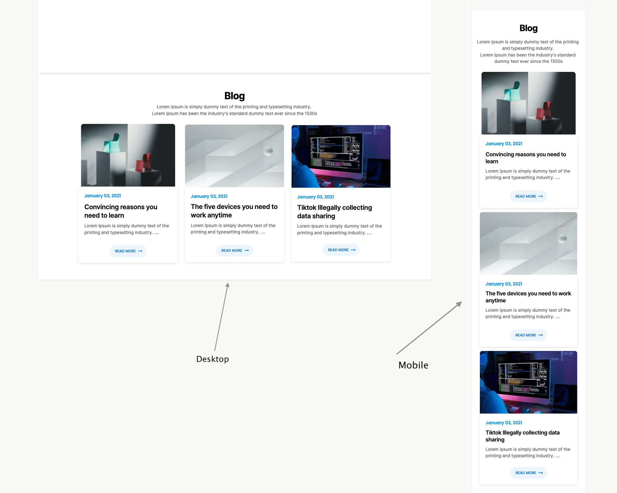
Responsive columns make it easy for you to create layouts that are responsive to different screen sizes. This is particularly useful when you want to create a webpage that behaves or looks different when viewed on different device sizes and orientations.
Of course, you can achieve responsiveness with other layouts, using responsive columns just makes it a lot easier and so much more intuitive for the next person who will be working on the project.
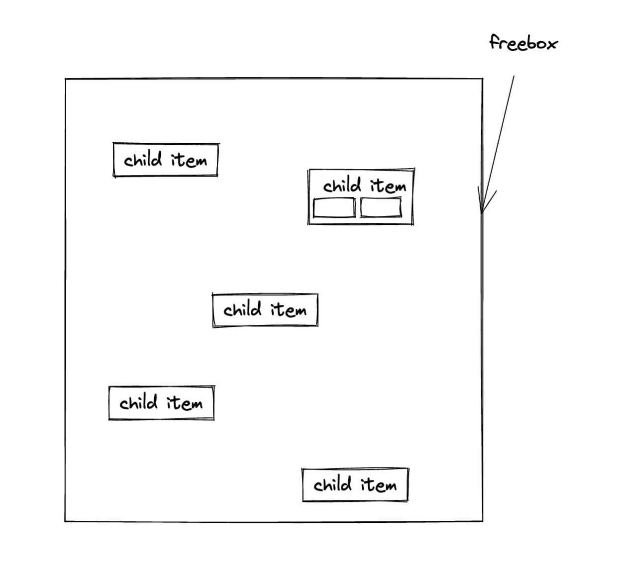
Freeboxes
Freeboxes are layouts that allow you to position items anywhere on the screen. This is useful for creating layouts that are flexible and can be used for different purposes. Think of it as the equivalent of absolute positioning in CSS. Here’s a rough sketch:
Spacing
Spacing in Plasmic is not different from the regular CSS spacing pattern. It is done by applying margin and padding values to the items you want to effect a space on.
Adding padding will create a space between the content and the internal borders of the target layout while margin will do the opposite and add outward spacing from the borders of the layout.
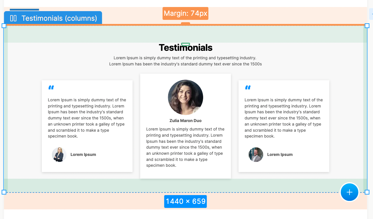
According to the picture above, the target box is highlighted with a light-blue border to which I have applied a margin of 74 pixels to the top and bottom. This area is marked with a light-orange background. I added a padding of 74 pixels to the left and right of the box as well. The padding area is consequently highlighted in a light-green background to make it more distinct from the layout itself.
Sizing
We have 5 sizing properties for layouts in Plasmic
- Hug - This property sets the size of a layout to equal the size of its content.
- Stretch - This set the size of the layout to take all remaining available space in the artboard/viewport
- Full-bleed - This one is simillar to stretch, but is mostly used on the top level of a page. It will take up the entire width of the page, including the padding on the sides of the page. Very useful for creating a full-width background image or video.
- Fixed - This specifies an exact size for the layout e.g H: 400px, W: 500px
- Advanced units - Plasmic allows you to create custom size units of choice based on your design system or just generally as a preference for reusability.
If you’d prefer to watch us go through this layouts and see how they affect the layout of a webpage in practice, you can watch the video below.
Follow @plasmicapp on Twitter for the latest updates.