Learning flexbox visually
- Authors
- Link
- Adam Ladrach

- Last updated
CSS flexbox revolutionized web layout design when it was introduced, offering a more intuitive way to create responsive layouts compared to traditional CSS positioning methods. But while flexbox solves many layout challenges, it still comes with its own learning curve. Let’s explore what it is, how it works, and visualize it in your head so that you can learn it once and for all.
Understanding flexbox fundamentals
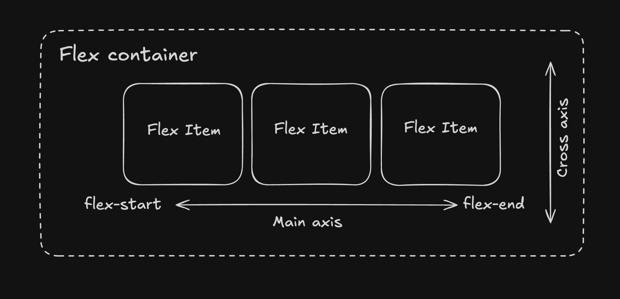
Flexbox, or the Flexible Box Layout Module, provides a more efficient way to arrange, align, and distribute space among items in a container. Unlike the old CSS layout strategies that rely heavily on floats and positioning, flexbox is specifically designed for one-dimensional layouts to act as a row or a column.
Key flexbox concepts
To work with flexbox, you need to understand the following main concepts:
- Flex Container: The parent element that has
display: flexapplied to it - Flex Items: The direct children of the flex container
- Flex Axis: The axis along which flex items are laid out. It can be horizontal (row) or vertical (column).
- Flex Grow/Shrink: The ability of flex items to grow or shrink to fill the available space.
- Flex Basis: The initial size of a flex item before any adjustments are made.
- Flex Wrap: The ability of flex items to wrap to the next line when there is no space left in the container.
Let’s look at the basic syntax:
.container {
display: flex; /* or display: inline-flex */
flex-direction: row; /* default: row | row-reverse | column | column-reverse */
flex-wrap: nowrap; /* default: nowrap | wrap | wrap-reverse */
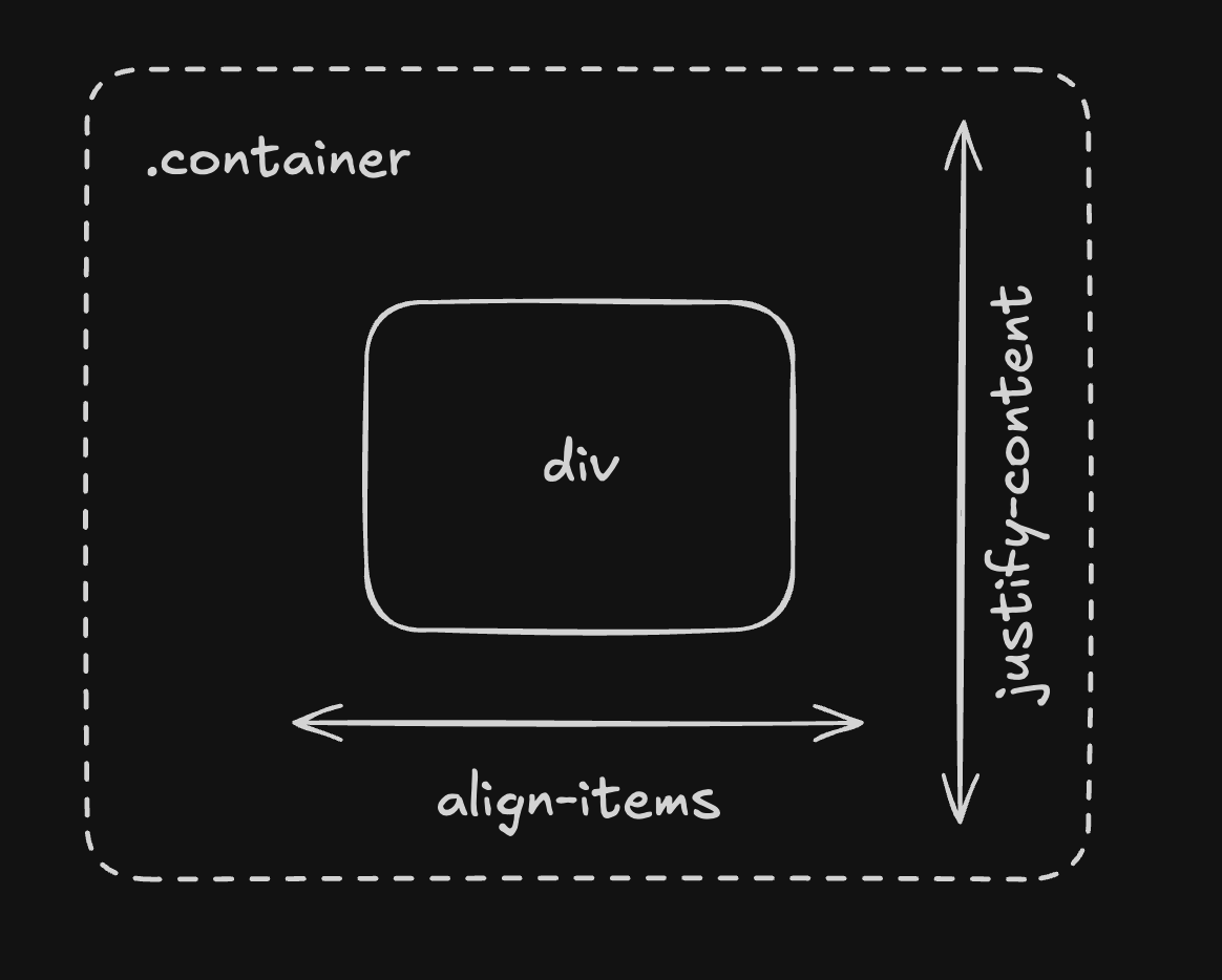
justify-content: flex-start; /* default: flex-start | flex-end | center | space-between | space-around | space-evenly */
align-items: stretch; /* default: stretch | flex-start | flex-end | center | baseline */
align-content: normal; /* default: normal | flex-start | flex-end | center | space-between | space-around | space-evenly | stretch */
gap: 10px; /* gap between items */
}
.item {
order: 0; /* default: 0 */
flex-grow: 0; /* default: 0 */
flex-shrink: 1; /* default: 1 */
flex-basis: auto; /* default: auto */
/* shorthand */
flex: 0 1 auto; /* grow shrink basis */
align-self: auto; /* default: auto | flex-start | flex-end | center | baseline | stretch */
}
Common flexbox Use Cases
1. Centering content
Centering elements both horizontally and vertically has always been a challenge in CSS. With flexbox, it’s simple:
.container {
  display: flex;
  justify-content: center; /* horizontal centering */
  align-items: center; /* vertical centering */
  height: 300px; /* container needs a height for vertical centering to work */
}
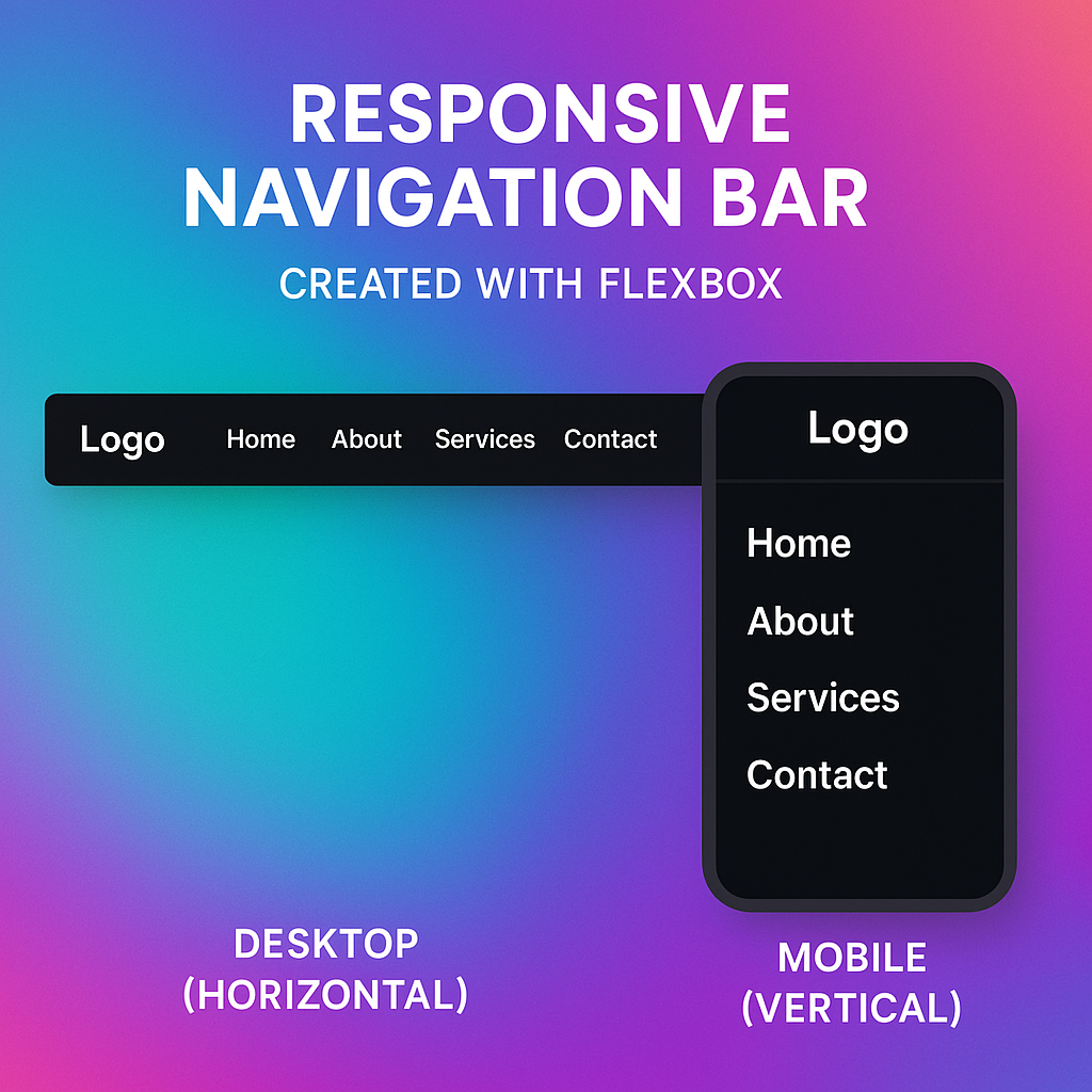
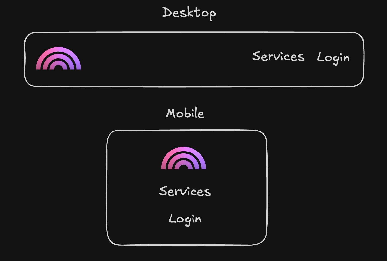
2. Navigation Bars
Creating flexible navigation bars that work across different screen sizes:
nav {
  display: flex;
  flex-direction: row; /* row is the default value for flex-direction, you can omit it */
  justify-content: space-between; /* space items evenly */
}

/* For mobile layouts */
@media (max-width: 768px) {
  nav {
    flex-direction: column;
  }
}

.nav-links {
  display: flex;
  gap: 20px; /* space between nav items */
}
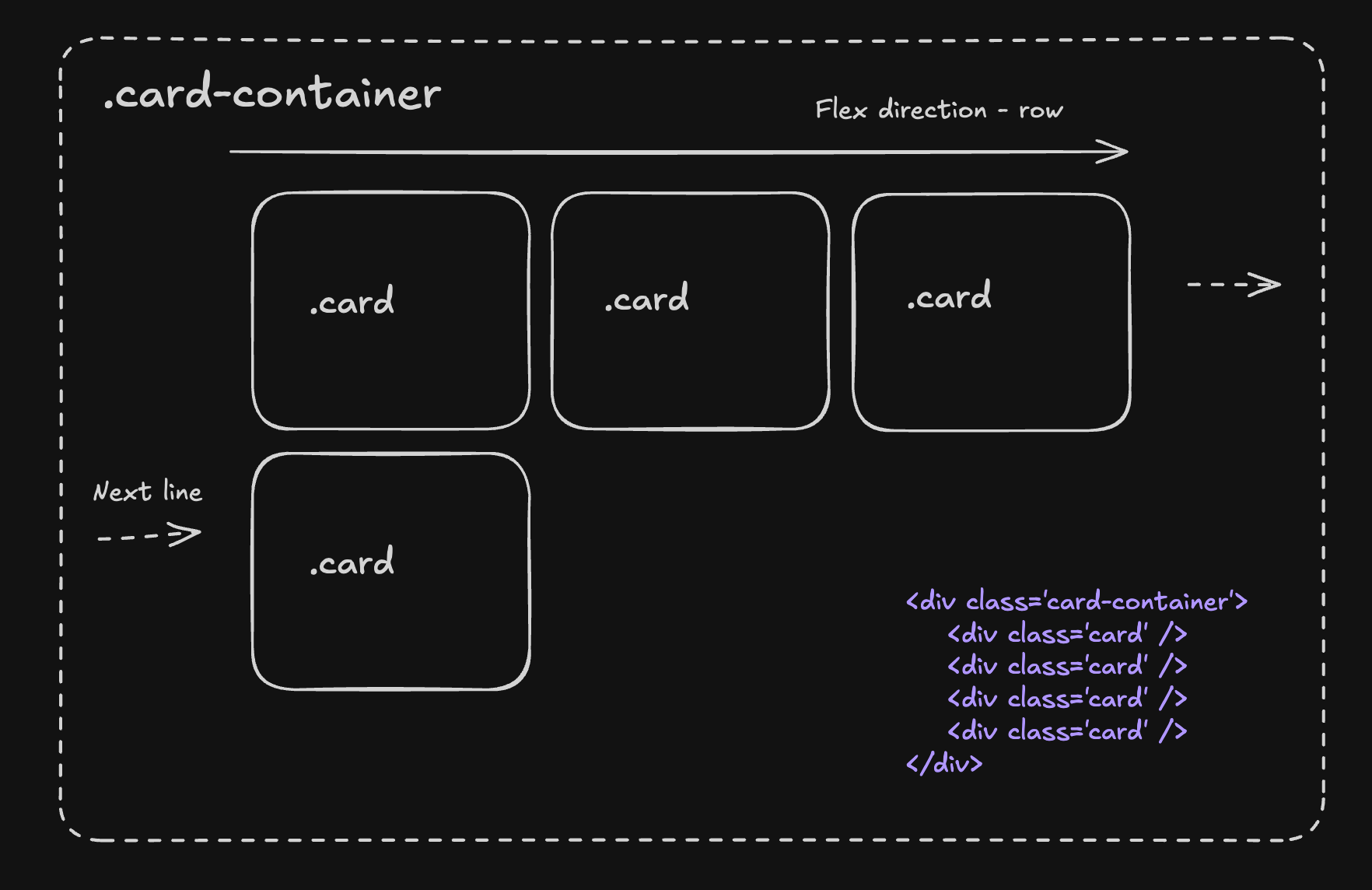
3. Card Layouts
Flexible card layouts that adjust based on available space:
.card-container {
  display: flex;
  flex-wrap: wrap;
  gap: 20px;
}

.card {
  flex: 1 1 300px; /* grow, shrink, basis */
  padding: 20px;
  border: 1px solid #ccc;
}
The challenges of creating layouts with flexbox by hand
Despite its power, styling with flexbox manually comes with challenges:
- Complex property combinations: The interaction between properties like
flex-grow,flex-shrink, andflex-basiscan be difficult to visualize. - Nested flexbox layouts: Managing multiple levels of flex containers can become confusing.
- Visual feedback: There’s no immediate visual feedback when writing CSS code manually.
- Trial and error: Getting layouts just right often involves a lot of tweaking and refreshing.
Let’s face it—while flexbox is powerful, there’s still a significant learning curve and potential for frustration, especially for those who aren’t CSS experts or prefer visual design approaches.
Visualize your learning
What if you could harness all the power of Flexbox without memorizing properties or writing CSS by hand? This is where Plasmic comes in.
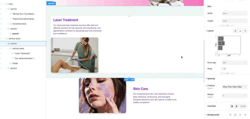
Plasmic is a visual builder that lets you create responsive layouts using Flexbox principles—but with an intuitive drag-and-drop interface instead of manual coding.
How no-code tools simplify the process
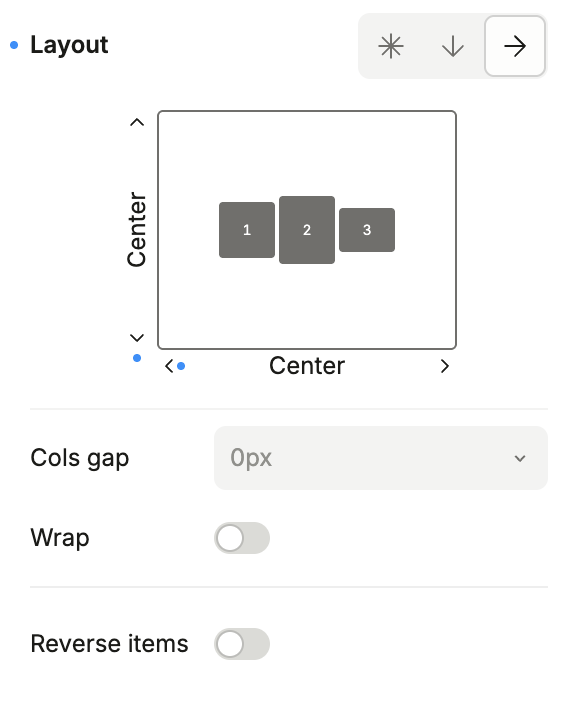
Visual Flex Controls: Instead of typing CSS properties, you can adjust flex settings visually and see changes in real-time.
Instant Preview: No need to save, refresh, and check—you see exactly how your layout responds as you make changes.
Responsive Testing: Test how your flexbox layouts behave across different screen sizes directly in the editor.
No CSS Knowledge Required: Design visually while Plasmic generates the optimal flexbox CSS behind the scenes.
Code Integration: For developers, no-code tools can generate clean code that integrates with your codebase.
Example: Creating a Responsive Card Layout
In manual CSS, you might write:
.card-container {
  display: flex;
  flex-wrap: wrap;
  justify-content: center;
  gap: 20px;
}

.card {
  min-width: 0;
  padding: 20px;
  border-radius: 8px;
  box-shadow: 0 2px 8px rgba(0, 0, 0, 0.1);
}
In Plasmic you simply:
- Drag in a horizontal stack component
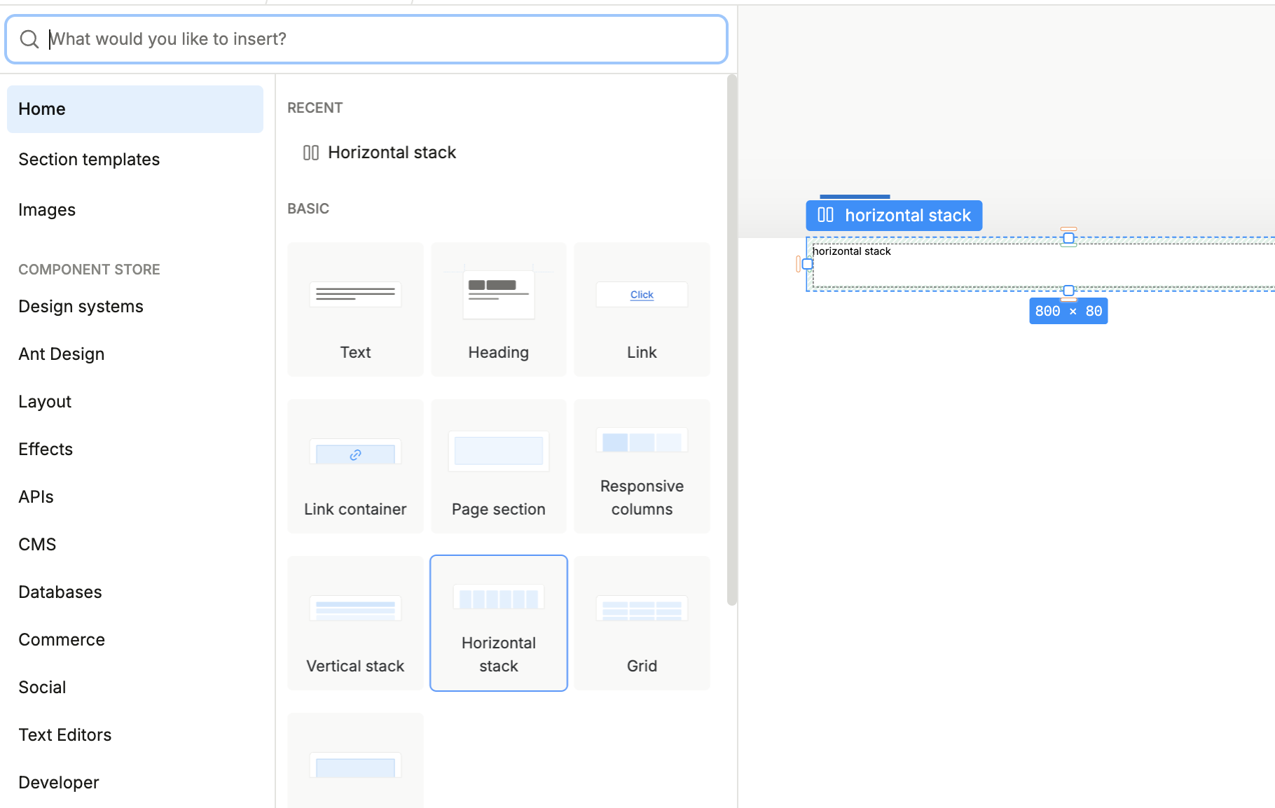
- Add your card components inside
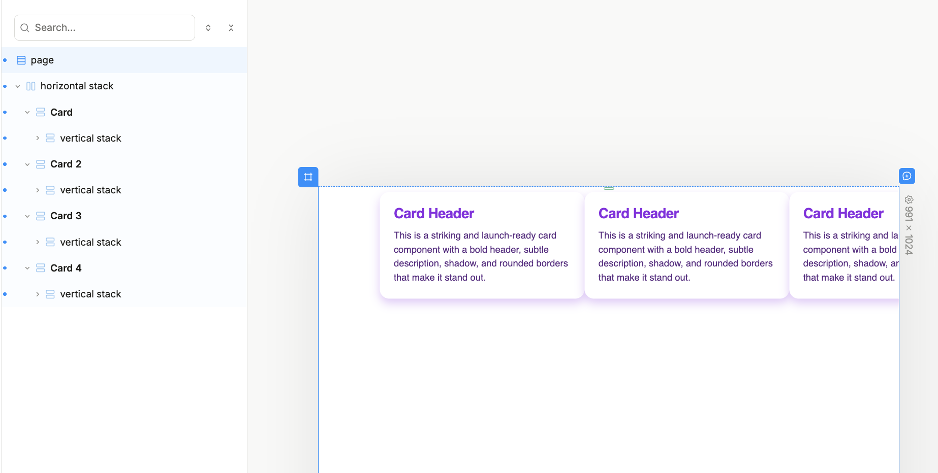
- Adjust spacing, wrapping, and alignment visually
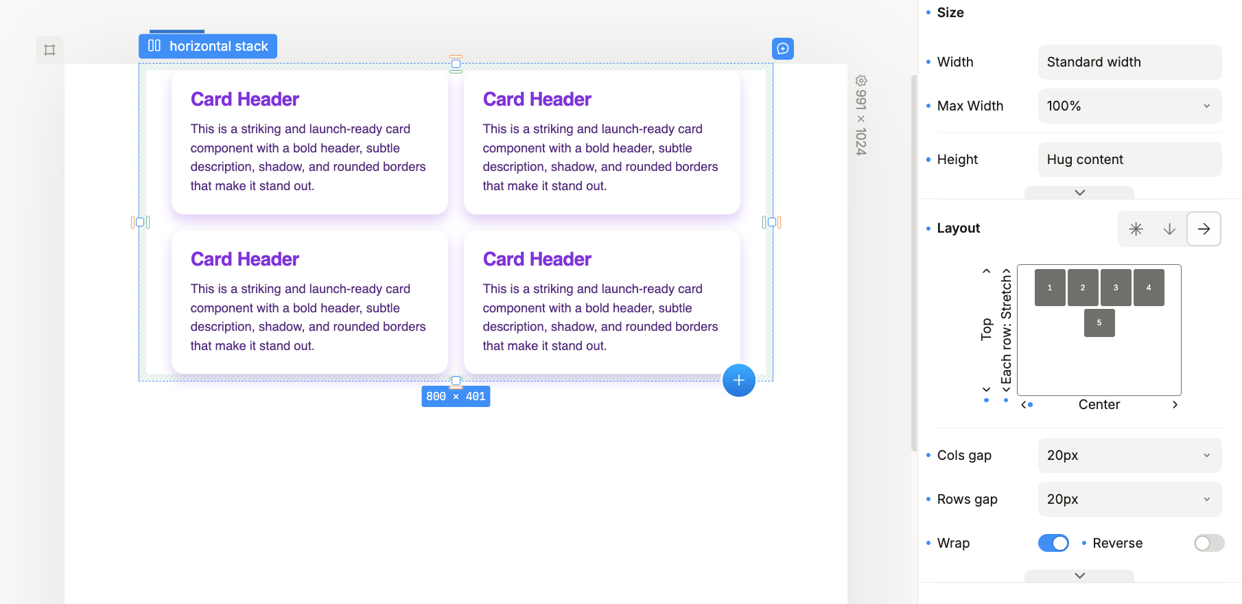
- Ensure the design looks great on all breakpoints, adjust if needed—just click the “Preview” button to see how it looks on different screen sizes.
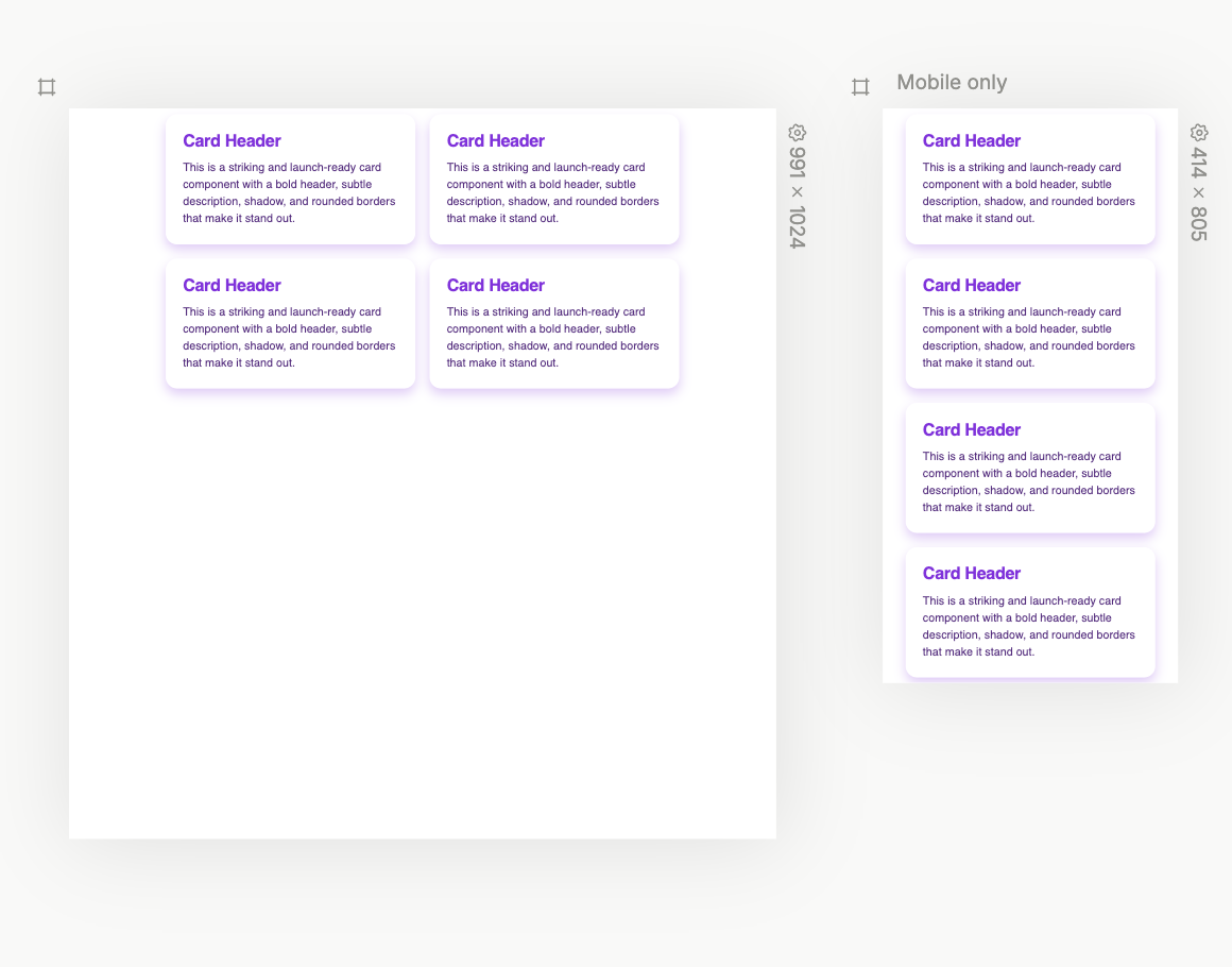
No CSS needed—just visual design with immediate feedback.
Frequently Asked Questions about flexbox
What is the difference between flexbox and grid?
Flexbox is designed for one-dimensional layouts (either a row or a column), while CSS Grid is designed for two-dimensional layouts (rows and columns together). Flexbox works from the content out, while Grid works from the layout in. Plasmic supports both layout methods with its visual interface.
Is flexbox supported in all browsers?
Yes, flexbox is supported in all modern browsers. However, there are some minor inconsistencies in implementation that can cause headaches. Plasmic handles these cross-browser inconsistencies automatically.
How do I center something vertically with flexbox?
To center an item vertically with flexbox, set the parent container to display: flex and align-items: center. In Plasmic, this is as simple as clicking the center alignment button in the visual interface.
Can I nest flexbox containers?
Yes, you can nest flexbox containers to create complex layouts. However, this can become difficult to manage in code. Plasmic’s visual interface makes nested flexbox containers easy to visualize and edit.
How can I learn more about flexbox?
While there are many resources online for learning flexbox, the fastest way to master it is through visual experimentation. Try Plasmic’s free visual builder to see flexbox in action without writing code.
Follow @plasmicapp on Twitter for the latest updates.