How to master any no-code web design tool, once and for all
- Authors
- Link
- Alex Noel

- Last updated
Here’s a secret that no one tells you when you start learn how to build visually: every platform is built on the same foundational concepts. Plasmic, Webflow, Framer, Figma, or any other visual builder — they’re all built on the same underlying principles.
Rather than memorizing where buttons live in each tool, focus on the underlying concepts — that knowledge stays relevant far longer and applies even beyond visual development.
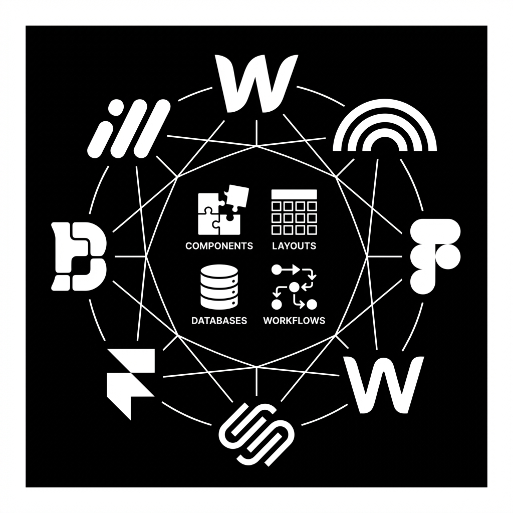
Once you internalize these core concepts, switching between platforms becomes less about learning something new and more about finding where familiar features live in a different interface. It’s like learning to drive — once you understand steering, acceleration, and braking, you can drive pretty much any car.
Let’s look at the core building blocks you’ll encounter everywhere:
Pages
Every no-code platform starts with the concept of a page. A page is simply a canvas that represents a single screen or view that users will see when they visit a URL.
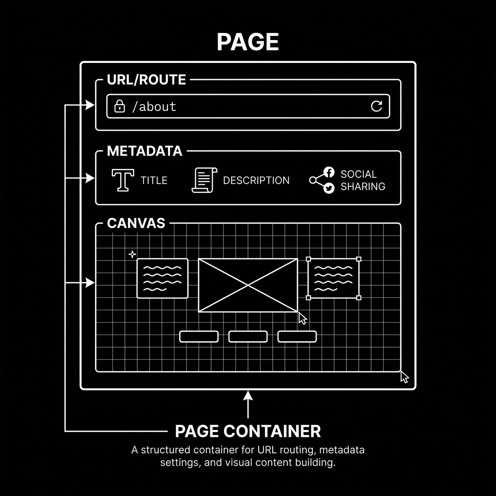
Think of pages as the containers that hold everything else. In traditional web development, each page corresponds to an HTML file. In no-code tools, you’re visually constructing what will become that file.
Pages typically have:
- A URL or route — the address where the page lives (e.g.,
/about,/contact,/blog/my-post) - Metadata — title, description, and social sharing information
- A canvas — the visual area where you build the page content
Some platforms call them “pages,” others call them “files”, “screens” or “scenes.” The terminology differs, but the concept is identical. When you create a new page in any platform, you’re essentially saying: “I want a new URL where users can land.”
Components
If pages are the containers, components are the building blocks you fill them with.
A component is a reusable piece of UI — a button, a card, a navigation bar, a hero section. The magic of components is that you design them once and reuse them everywhere. Change the component in one place, and every instance updates automatically.
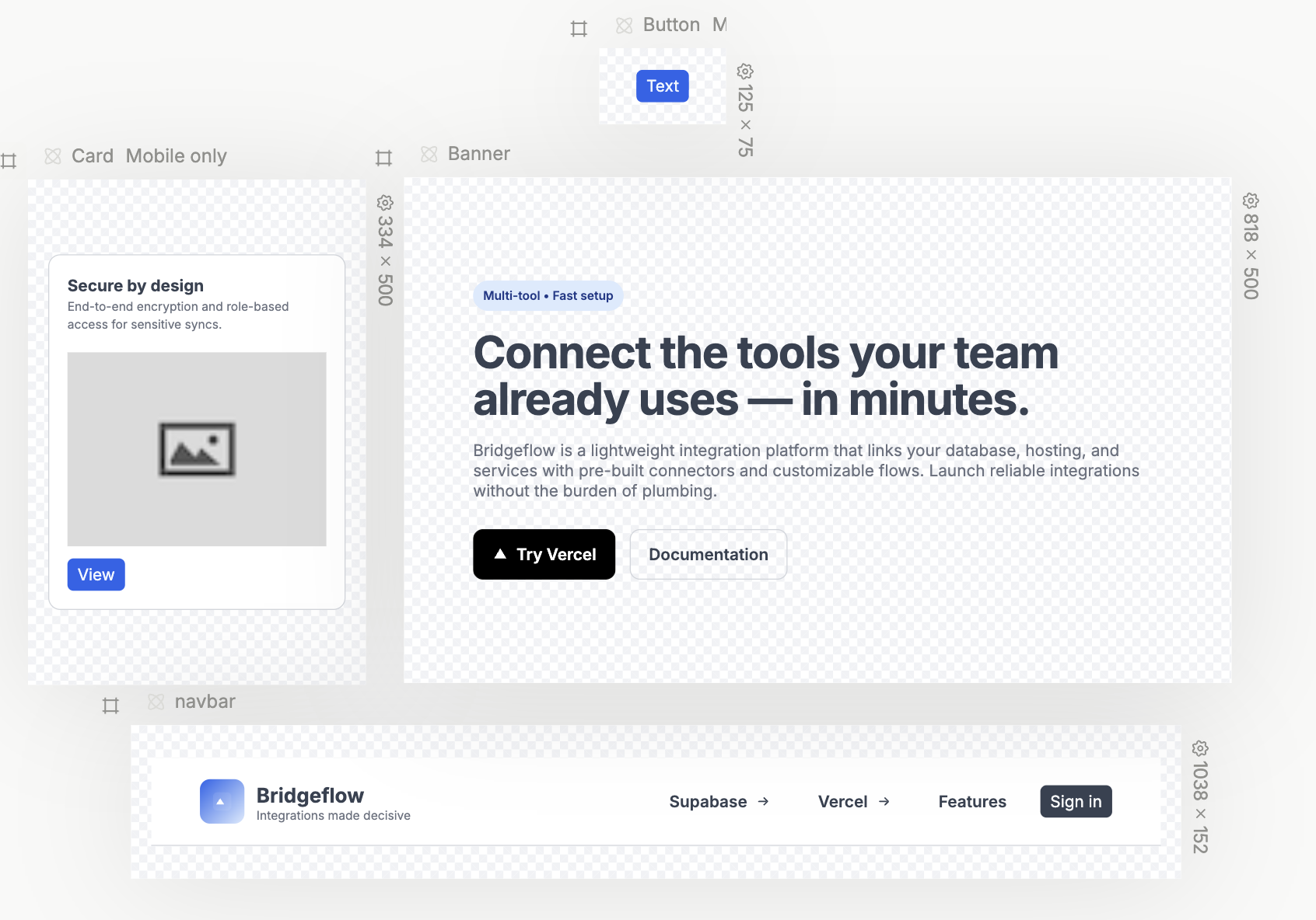
Components can be:
- Primitive — basic elements like text, images, buttons, and inputs
- Composite — built from multiple primitives, like a card containing an image, title, and description
- Nested — components containing other components, creating a hierarchy
Every no-code tool provides a library of built-in components. But the real power comes when you create your own. A custom component might be your specific button style, your branded card layout, or your unique pricing table.
The mental model is simple: if you’re going to use something more than once, make it a component.
Slots
Slots are placeholders inside components where you can drop different content each time you use it.
Here’s a common scenario: you build a card component with a specific layout — image on top, title, description, button at the bottom. But sometimes you want to swap the image for a video. Or add a badge. Or remove the button entirely. Without slots, you’d need to create multiple card variations for each use case.
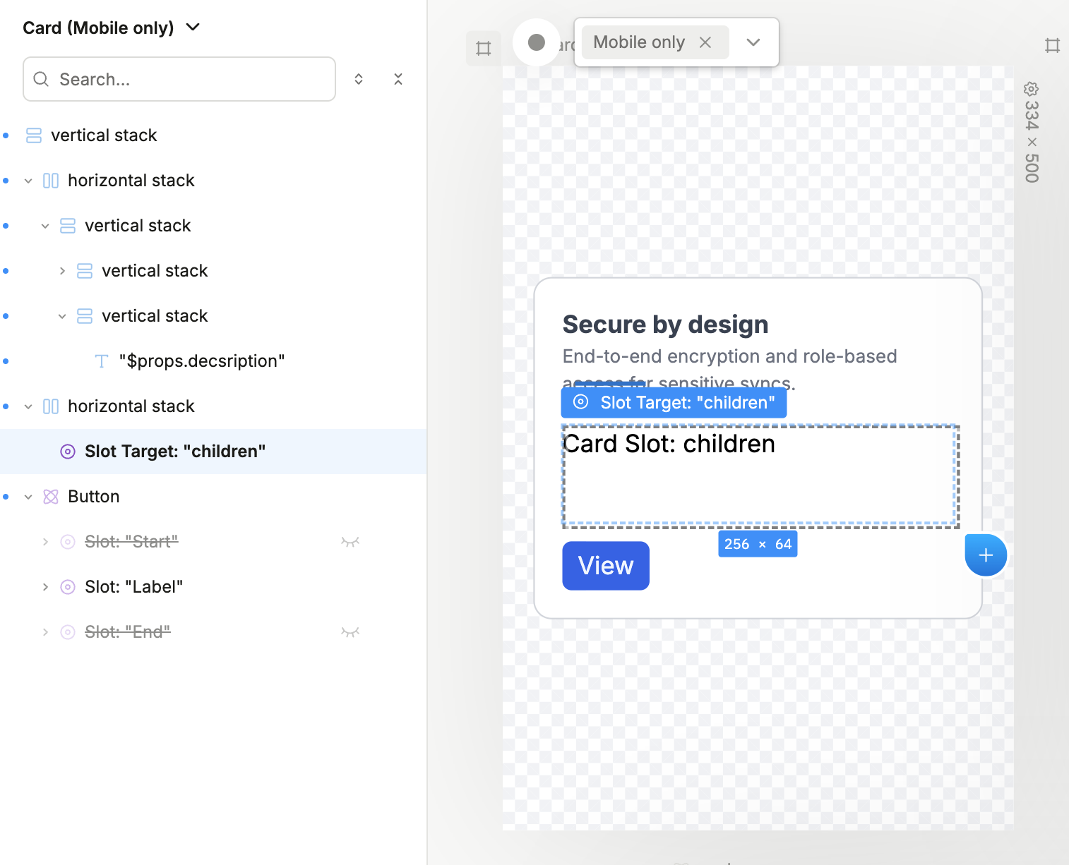
Slots solve this by letting you define “empty spaces” in your component that accept whatever content you drop into them. The card’s structure stays consistent, but the content inside the slots can vary.
Think of slots like picture frames. The frame (your component) has a defined shape and style, but you can put any picture (content) inside it.
Different platforms use different terminology:
- Plasmic: Slots
- Figma: Component properties with instance swap
- Webflow: Slots (in symbols)
- Framer: Children props
Same concept — flexible placeholders that make components genuinely reusable.
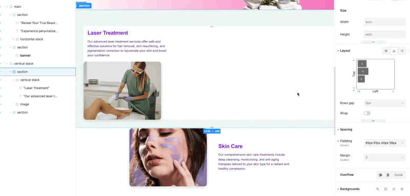
Frames and Stacks
Now we get to the heart of layout: frames and stacks.
A frame (sometimes called a container, box, or div) is simply a rectangular area that can hold other elements. Frames are the fundamental organizational unit in every no-code tool.
Stacks are frames with a specific behavior — they automatically arrange their children in a row or column:
- Horizontal stacks (or rows) lay out children side by side, from left to right
- Vertical stacks (or columns) lay out children top to bottom
Under the hood, stacks are typically CSS Flexbox containers. But you don’t need to know that — you just need to understand the pattern:
- Want items side by side? Use a horizontal stack.
- Want items stacked on top of each other? Use a vertical stack.
The beauty of stacks is their predictability. Drop three items into a horizontal stack, and they’ll line up horizontally. That’s it.
Different platforms use different names:
- Plasmic: Horizontal Stack, Vertical Stack
- Figma: Frame (with auto layout)
- Webflow: Flexbox with row/column direction
- Framer: Stack
Same concept, different labels.
The Box Model
Every element in every no-code platform follows the box model. This is arguably the most important concept to understand, and once you do, layout stops being mysterious.
The box model defines four layers around every element:
- Content — the actual stuff inside (text, image, etc.)
- Padding — space between the content and the border (inside the box)
- Border — the edge of the box (can be visible or invisible)
- Margin — space between this box and neighboring boxes (outside the box)

Here’s how to remember it easily: padding pushes inward, margin pushes outward.
- Want more breathing room inside a button? Add padding.
- Want more space between two buttons? Add margin.
Every visual builder gives you controls for these four properties. Once you understand that padding is internal space and margin is external space, you can style layouts in any platform.
Breakpoints
Here’s where responsive design comes in. Breakpoints define how your layout adapts to different screen sizes.
A breakpoint is essentially a threshold: “When the screen width is below X pixels, apply these different styles.” This is how the same page can look one way on desktop and completely different on mobile.
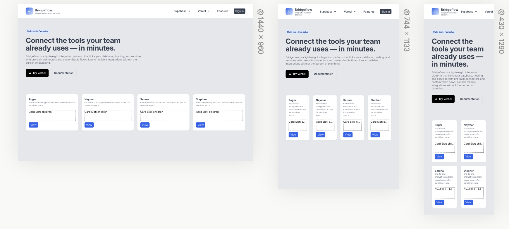
Most platforms provide preset breakpoints (something like 1280px for desktop, 768px for tablet, 480px for mobile), but you can usually customize them.
The mental model is straightforward:
- Design your desktop layout first (or mobile first — both approaches work)
- Switch to a smaller breakpoint
- Adjust anything that doesn’t look right at that size
- Repeat for each breakpoint
Changes you make at a smaller breakpoint only affect that size and below — they don’t mess with your larger layouts. This cascading behavior is consistent across nearly every visual builder.
Different terminology you might see:
- Plasmic: Screen variants (and breakpoints)
- Figma: Device frames / responsive components
- Webflow: Breakpoints
- Framer: Breakpoints
Variants
Variants are how components adapt to different states or contexts. They’re one of the most powerful concepts in visual design.
A button, for example, might have several variants:
- Base — the default state
- Hover — when the user’s cursor is over it
- Pressed — when the user clicks
- Disabled — when the button can’t be clicked
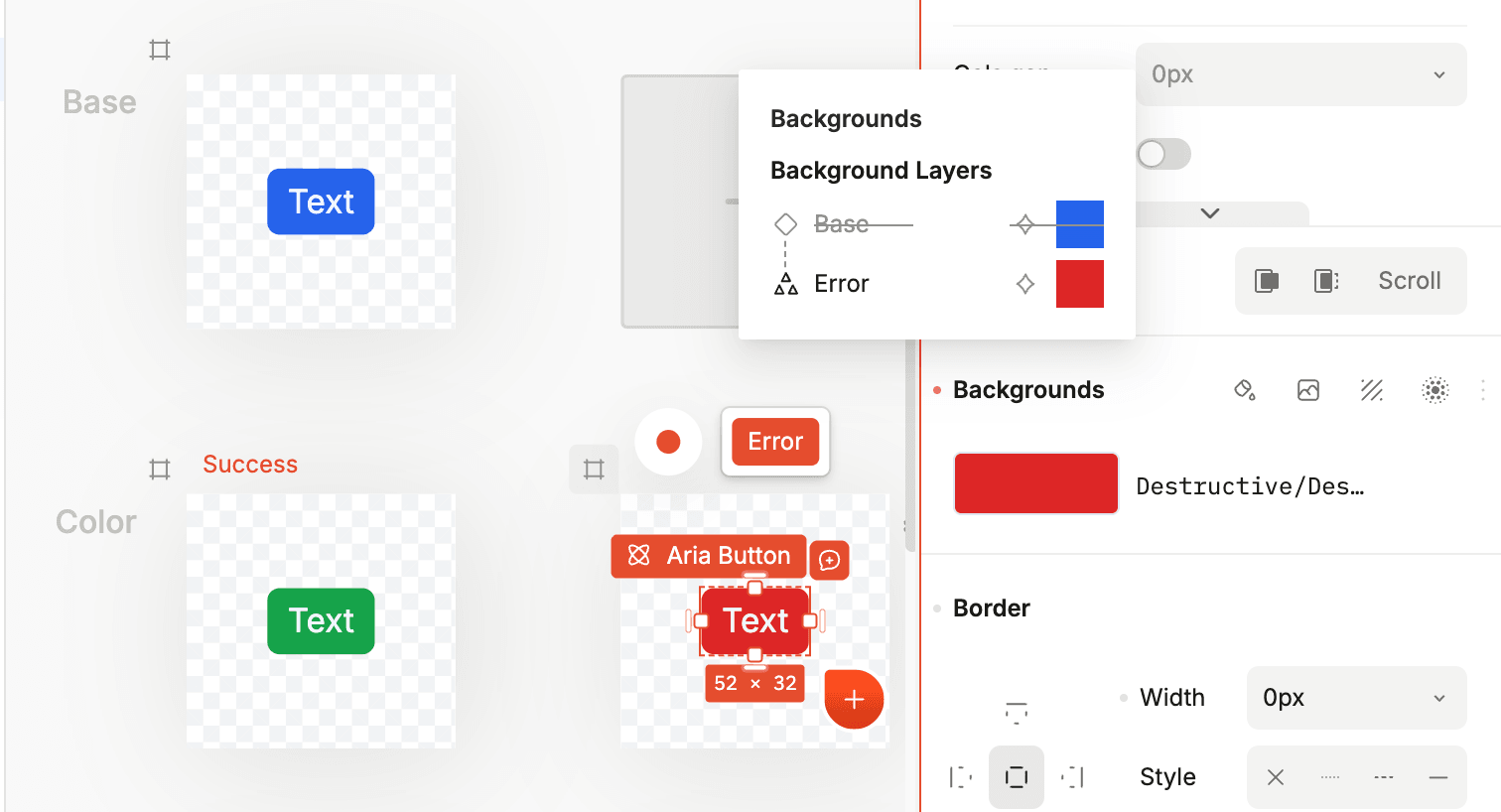
Instead of creating four separate buttons, you create one button component with four variants. Each variant can have different styles — colors, sizes, shadows — but they’re all the same component.
Variants go beyond interaction states. You might have:
- Size variants — Small, medium, large
- Style variants — Primary, secondary, ghost
- Content variants — With icon, without icon
The concept extends to entire pages too. An e-commerce product page might have a “loading” variant, a “has reviews” variant, and an “out of stock” variant — all living within the same page component.
Different platforms handle variants differently:
- Plasmic: Variants
- Figma: Variants and component properties
- Webflow: States and interactions
- Framer: Variants
But the underlying idea is always the same: one component, multiple appearances.
States and Variables
States (sometimes called variables) let you store and track values that can change during a user’s session.
Think about a counter. You need somewhere to store the current number. That’s state. Or a shopping cart — you need to track which items have been added. That’s state too.

States become powerful when you connect them to your UI:
- A toggle switch can control a boolean state (
darkMode: true/false) - A form input cna updates a text state (
searchQuery: "shoes"that - A counter might increment a number state (
itemCount: 3)
You can then use these states to conditionally show/hide elements, change styles, or pass data to other components. “If isLoggedIn is true, show the dashboard. Otherwise, show the login form.”
Different terminology across platforms:
- Plasmic: States, page/component states
- Figma: Variables
- Webflow: Custom attributes, CMS-bound values
- Framer: Overrides, component states
The concept is identical: values that can change and affect what users see.
Interactions
Static pages are nice, but interactions bring designs to life.
An interaction is simply: when X happens, do Y. That’s it. Every interaction in every no-code platform follows this pattern.

The trigger can be:
- Click/tap
- Hover
- Scroll position
- Page load
- Form submission
- Keyboard input
- etc.
The action can be:
- Change a style property
- Navigate to another page
- Show/hide an element
- Update a state/variable
- Play an animation
- Submit data to a backend
- etc.
When you understand that interactions are just trigger-action pairs, they become much less intimidating. You’re not “coding” — you’re just saying “when the user clicks this button, show this menu.”
More complex interactions chain multiple actions together or use conditions: “when the user clicks this button AND they’re logged in, navigate to the dashboard.”
Transitions
Transitions smooth out changes between states. Without transitions, changes are instant and jarring. With transitions, they’re fluid and polished.
A transition defines:
- What property is changing (color, size, position, opacity)
- How long the change takes (duration)
- The timing curve (easing — linear, ease-in, ease-out, ease-in-out)
- Any delay before the transition starts
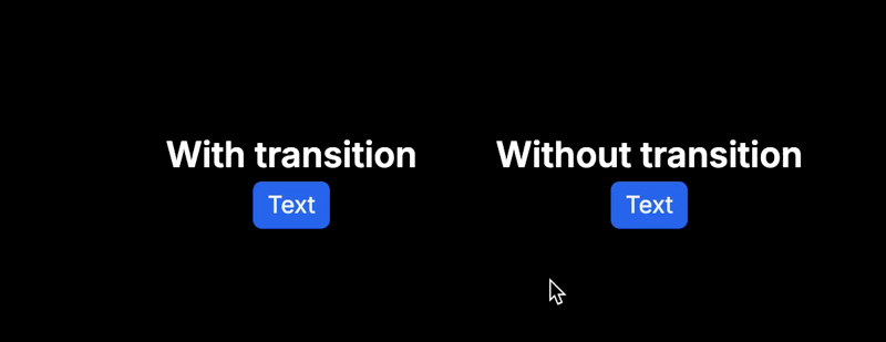
When you add a hover state to a button that changes its background color, a transition makes that color shift smoothly over, say, 1 second instead of snapping instantly.
Common properties to transition:
- Opacity — fade in/out effects
- Transform — movement, scaling, rotation
- Background color — color shifts
- Border — border color and width changes
- Shadow — shadow intensity changes
Pro tip: 0.2 to 0.3 seconds is the sweet spot for most UI transitions. Fast enough to feel responsive, slow enough to be noticeable.
Transforms
Transforms change how an element is displayed without affecting the document flow. They’re the secret to dynamic, engaging interfaces.
The four core transforms are:
- Translate — move the element (X, Y, Z axes)
- Scale — resize the element (grow/shrink)
- Rotate — spin the element (degrees)
- Skew — tilt the element (distort angles)

Transforms are often combined with transitions and interactions. For example:
- On hover, scale a card to 1.05× its size (subtle zoom effect)
- On click, rotate an accordion icon 180° (flip the arrow)
- On scroll, translate elements into view (slide-in animation)
What makes transforms special is that they don’t affect layout. A scaled-up element doesn’t push its neighbors around — it just visually appears larger. This makes transforms ideal for animations and micro-interactions.
Putting It All Together
Let’s see how these concepts combine in a real example: an interactive card component.
- Page: Create a page for the card to live on
- Component: Create a card with an image, title, and description
- Slot: Add a slot for flexible content inside the card
- Frame/Stack: Use a vertical stack to arrange the content top-to-bottom
- Box Model: Add padding inside the card for breathing room, border-radius for rounded corners
- Breakpoint: Adjust the card width and padding for mobile
- Variant: Create a “hover” variant with a different shadow
- State: Track whether the card is “expanded” or “collapsed”
- Interaction: On click, toggle the expanded state
- Transition: Set a 0.3s ease-out transition on the scale property
- Transform: On hover, scale the card to 1.02×

That’s 11 concepts working together in one small component. And here’s the thing: the exact same approach works in Plasmic, Webflow, Framer, or any other platform. The buttons might be in different places, the terminology might vary slightly, but the mental model is identical.
Why This Matters
The no-code landscape is vast and constantly evolving. New tools launch every month, each with their own interfaces and terminology. If you try to learn each platform from scratch, you’ll be on an endless treadmill.
But if you focus on the fundamentals — you’ll get knowledge and experience that will last. You’re not learning Plasmic or Webflow or Framer. You’re learning visual design systems.
When you pick up a new tool, you’ll spend five minutes asking “where’s the button to add a variant?” instead of struggling to understand what a variant even is.
That’s the difference between being a specialist in one tool and being versatile across all of them.
Start Building
The best way to solidify these concepts is to build something. Start with a simple project and consciously apply each concept.
By the end of that project, these concepts will be second nature. And when you inevitably try a new platform? You’ll feel right at home.
Follow @plasmicapp on Twitter for the latest updates.