History of Front-End Development
- Authors
- Link
- Alex Noel

- Last updated
What comes first to your mind when you hear the term front-end development? Websites, Plasmic, React, HTML, or it doesn’t even buzz a word for you?
Anything that you see on the screen nowadays is a front-end, and it’s often taken for granted as something very simple. People don’t really understand how complex it is to create a visual representation of any data, and on top of that, make it interactive. This is what all front-end is about — visualising different sorts of information so that end-user (yes, you) would have an easy time ingesting it.
And this is exactly what we are going to talk about in this article — the history of this, without exaggeration, craft.
Basic necessities - food, shelter, and a button…
Humans were always looking for ways to control life around themselves. Across the lengthy journey of a technological revolution, a question arose at one point in time: How can one control the state of a mechanical or electrical appliance? This was, in fact, the moment when we think the first front-end engineer appeared, and decided to create a concept of buttons and toggles to tame the primordial metalborn creatures.
When was the first button invented? A quick internet search would suggest something like this:
Push buttons were invented sometime in the late 19th century, certainly no later than 1880.[2] The name came from the French word bouton (something that sticks out), rather than from the kind of buttons used on clothing.[2] The initial public reaction was curiosity mixed with fear, some of which was due to widespread fear of electricity, which was a relatively new technology at the time.
After more than a century, we use these daily without being afraid that our lives might be at risk because of them. That is, unless you’re not clicking the button to do something illegal, which you don’t, right?

All in all, this has been the main means of interacting with electromechanical tools. With time, it evolved again and again, gaining increasingly sophisticated looks, types, as well as ways to trigger them. In the modern day world, it has become no more than a line of code, whilst at the same moment, the pinnacle of technology — the big and terrible <button />.
The first predecessor of HTML – Memex
Before we had markup languages, before GUIs, before the idea of a web page even existed — we had Memex.
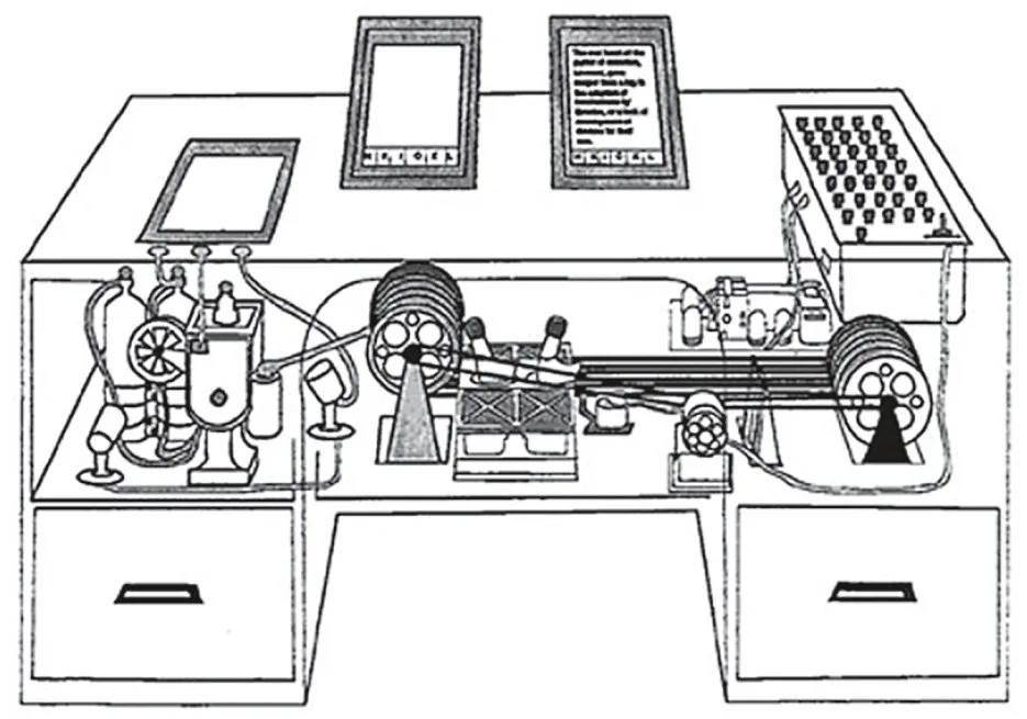
In 1945, Vannevar Bush published an essay called As We May Think, where he described a theoretical machine that could store books, records, and communications, all navigable through a system of links. You’d interact with this “Memex” via screens, levers, and buttons, calling up information and jumping from one item to another — non-linearly.
Sound familiar?
It was the first mainstream articulation of hypertext. And although the Memex never existed, it planted a seed. Not just for the web, but for the entire concept of user-driven navigation through information. A front-end idea, long before the term existed.
While backend computation was about number crunching and logic, Bush was thinking in terms of interface — how a human might interact with complex information without drowning in it.
This was the philosophical backbone for what would eventually become the World Wide Web.
Stone Computing Age
While Memex remained an idea, real computing marched forward — slowly and mostly in basements full of humming machines.
User interaction came via terminals — text-only interfaces with blinking cursors. The idea of “design” was non-existent. Output was for technicians, not regular people. But even here, seeds of front-end thinking existed: How should data be displayed? Where does a prompt go? How do you make things even minimally human-readable?
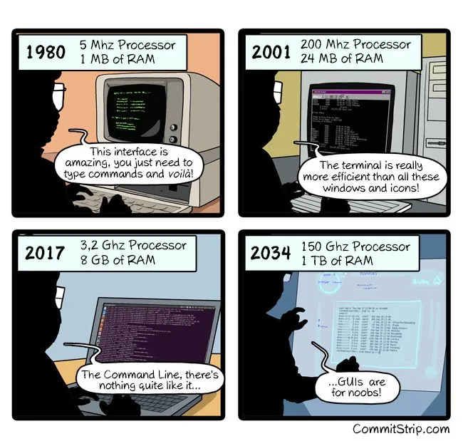
As systems became more advanced, GUI environments began to take shape — most famously with Xerox PARC, and then more commercially with Apple’s Macintosh in the 1980s. This was when interaction started shifting from command lines to windows, icons, and — importantly — clickable objects.
Front-end was still deeply tied to hardware, but the idea was clear: give users control through visuals.
Graphical interfaces — windows, icons, and the first visual languages
After years of green-screen terminals and blinking prompts, something strange started appearing on computer screens: a mouse pointer.
As it was already stated above, in the 1980s, Xerox and later Apple introduced the graphical user interface — windows, buttons, icons, scrollbars. It was a completely different idea of how people should interact with machines. Instead of memorizing commands, users could click things. Move things. Drag and drop.
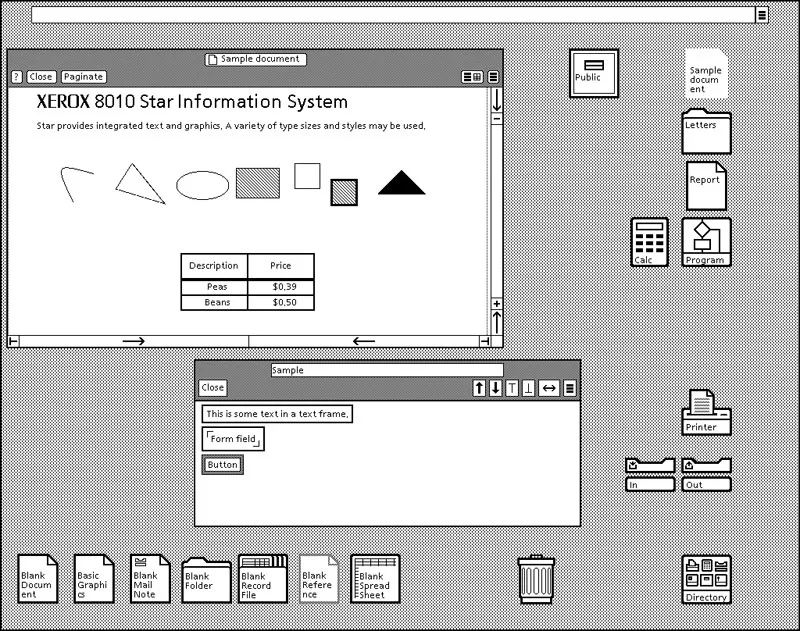
This wasn’t just a new coat of paint — it was a philosophical shift. The interface wasn’t something to tolerate anymore; it was something to design.
And behind all of this were early layout engines, visual hierarchies, and input handlers — the predecessors to what front-end developers would later wrangle in web browsers.
You had design systems before the term existed: menu bars, dialogs, tooltips. And you had the first hints of component thinking: the calculator app, the file picker, the trash can.
There was still no HTML or CSS, but the concepts of front-end development were already forming:
- Structure and layout
- Styling and hierarchy
- Interaction and feedback
By the time the web arrived, we didn’t start from zero. We already had mental models for visual interaction. HTML and CSS didn’t invent them — they translated them for the browser.
The invention of HTML/CSS — words that tell machines how to paint
In the early 1990s, Tim Berners-Lee wasn’t trying to build something flashy. He just needed a way to help researchers share documents over the internet without mailing floppy disks. What came out of it was HTML — the HyperText Markup Language.
HTML wasn’t a programming language, it was more like giving instructions to a librarian with a paintbrush:
“Put this line here, make it bold, throw in an image, and link it to this other thing.”
Suddenly, computers could present structured documents on screens — with actual formatting!
But HTML alone couldn’t handle style. It was like dressing up a mannequin with a Sharpie. So CSS came in a few years later (mid-90s) to separate content from appearance. Think of it as saying, “Let the content speak, but also make it wear a nice jacket.” Now you could style entire websites from a single sheet. Revolutionary stuff.
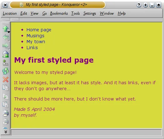
HTML and CSS were the beginning of front-end development as we know it — static, yes, but readable, shareable, clickable. For the first time, the front-end was open to anyone with a text editor and an FTP client.
Dreamweaver, WordPress, and jQuery — drag, drop, duct tape
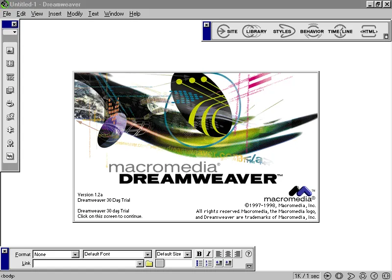
By the early 2000s, building websites by hand was still the norm, but the web had grown fast — and expectations with it. You needed images, layouts, menus, maybe even (gasp) rounded corners. Writing all that from scratch got old quick.
Enter Dreamweaver — Adobe’s visual web editor — a kind of MS Word for the web. You dragged boxes around and it vomited out some barely-readable HTML. Designers loved it. Developers held their nose. But still, it introduced the idea that maybe not everything had to be typed by hand.
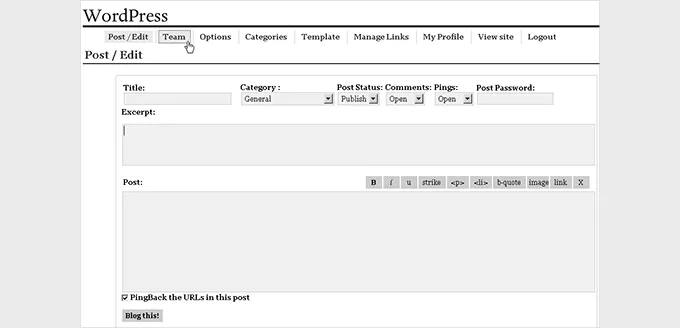
Meanwhile, WordPress exploded — first as a blogging tool, then as a full-on CMS. It made spinning up a site ridiculously easy. No need to know HTML. Just click, install a theme, and boom — you’re online. And while it never really killed front-end dev, it gave rise to a generation of non-coders who could still build things.
To patch over the rough edges of browser inconsistencies and add interactivity without diving deep into native JavaScript, developers leaned on jQuery. It was basically front-end duct tape:
“Find this button. When someone clicks it, do a thing. Done.”
For better or worse, this era made front-end more accessible — but also more chaotic.
JavaScript frameworks — a sacred war that never ends
Eventually, things got out of hand. Sites weren’t just collections of documents anymore; they were turning into full-blown applications. You had state, user flows, conditional rendering, real-time updates — and jQuery was like trying to build a skyscraper with IKEA furniture instructions.
So the first JavaScript frameworks came along.
AngularJS, Backbone, Ember, and eventually React, Vue.js, and Svelte — all built to help developers create complex user interfaces with reusable, composable components. Instead of manipulating the DOM directly, you told these frameworks what you wanted to happen, and they figured out how to do it efficiently.
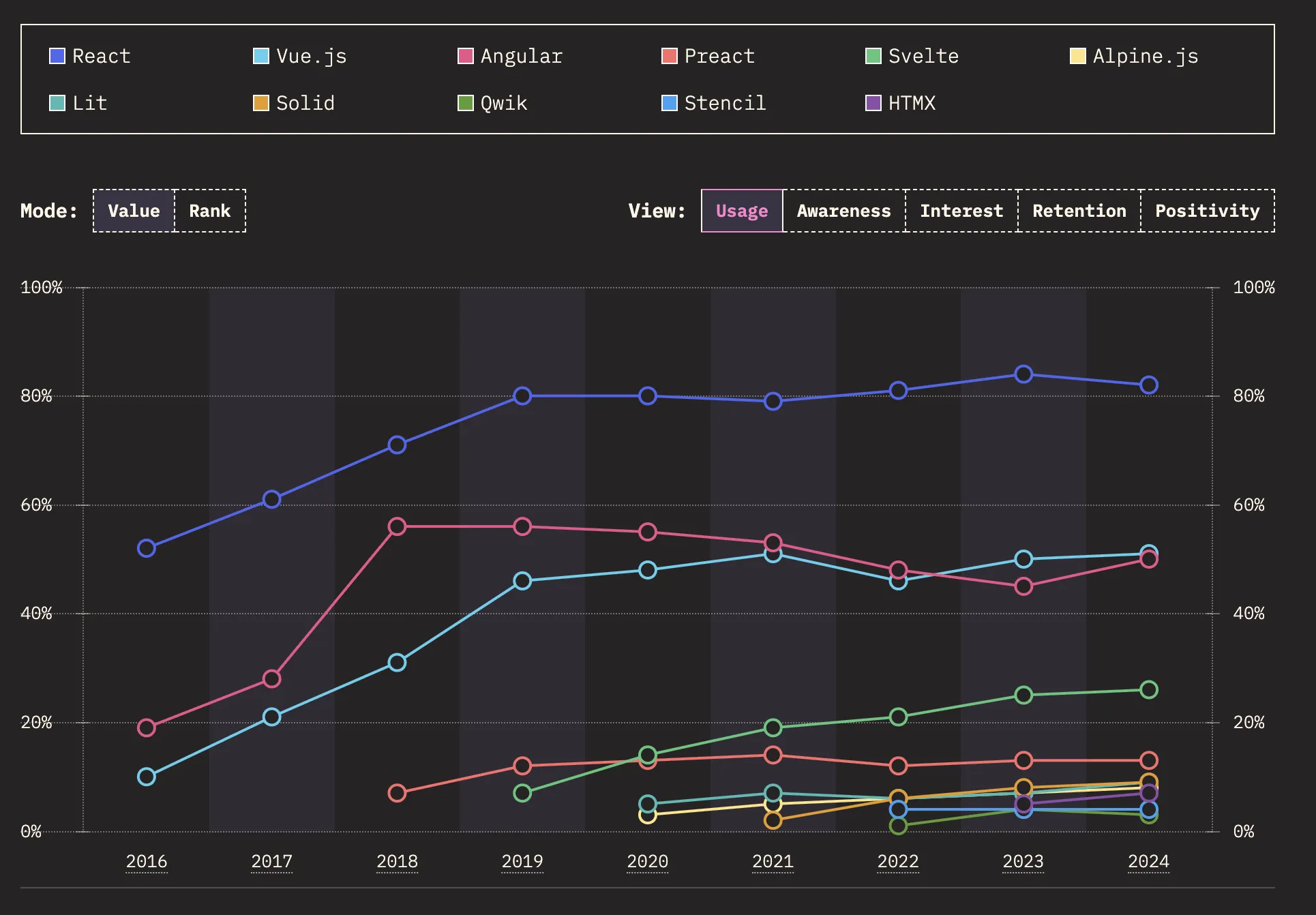
This marked a serious turning point. Front-end became its own engineering discipline. You had build tools, dependency graphs, state managers, lifecycle hooks. It got deep.
On one hand, you could now build highly dynamic apps that rivaled native software. On the other, you now needed to learn 7 tools just to show a “Hello World” message.
The rise of low-code tools — let people build without the jargon
As front-end development matured, it also got harder to break into. What started as “write some HTML and hit refresh” turned into configuring bundlers, managing state, and knowing whether your error is coming from the code you wrote or the 12 npm packages behind it.
That complexity opened the door for something else: low-code and visual development platforms.
At first, they looked like lightweight design tools — good for marketing sites, MVPs, and internal dashboards. But platforms like Plasmic quickly outgrew that perception. What set Plasmic apart was its ambition: not just to let non-developers design, but to let teams build production-grade front-ends collaboratively — all while still keeping clean code in the background.
In Plasmic, you weren’t locked into templates. You could build pixel-perfect interfaces visually, connect to live data sources, and drop in real components from your codebase. It didn’t fight with devs — it worked with them.
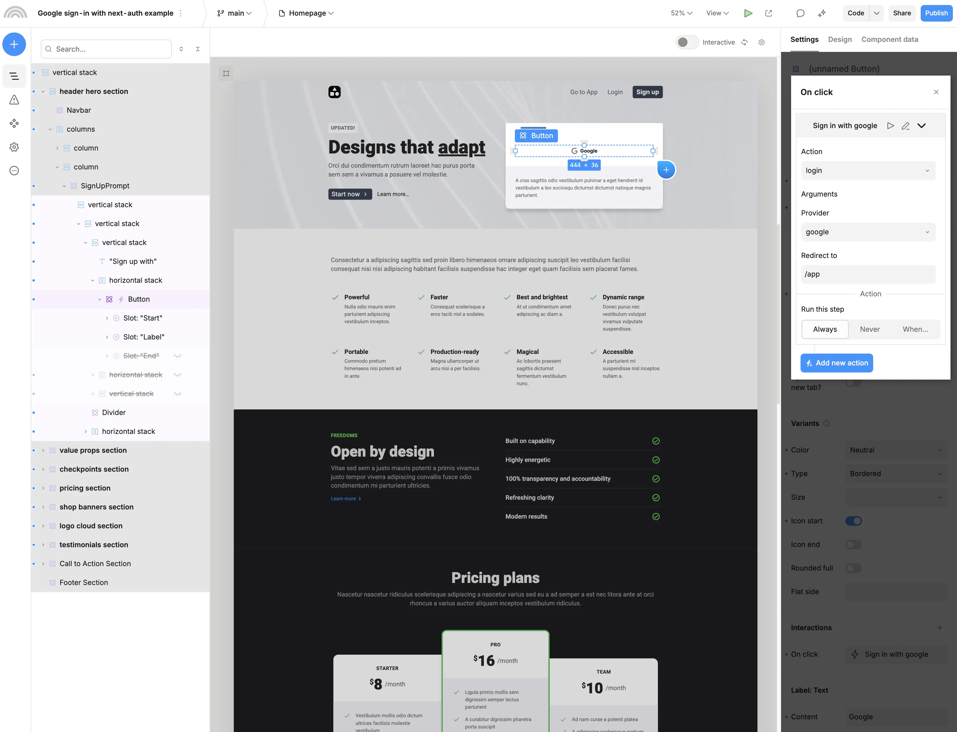
The result: engineers could focus on logic, APIs, and architecture, while designers and product people took control of layout, UX, and content flow — all without waiting for a ticket to be picked up in a sprint.
Low-code wasn’t about replacing front-end development. It was about taking the routine parts and making them faster — and letting more people participate in the process.
And just like that, front-end development gained a new partner — not a human, not a platform, but a model trained on code, design patterns, and more websites than you could ever scroll through.
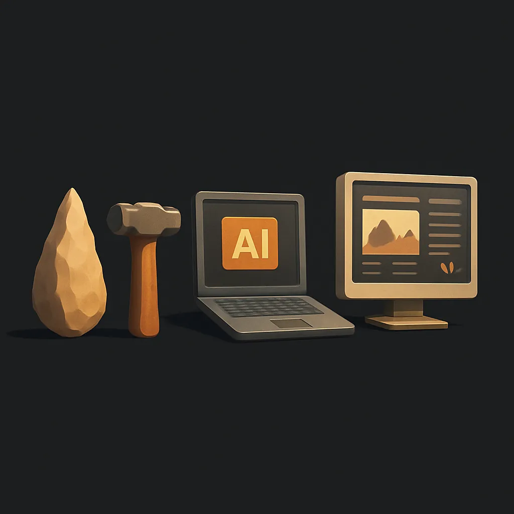
Vibe coding, AI-generated websites, and Cursor
Around 2022, a new player entered the scene: generative AI.
Tools started popping up that let you generate entire websites from a text prompt. You’d type:
“Make a landing page promoting my goods”
… and get back something shockingly close to a real site.
Of course, the results weren’t perfect. You still needed to tweak things. But it proved the point: front-end development could be assisted. You didn’t need to start from zero. Machines could give you a draft.
As AI tools got smarter, they stopped being autocomplete gimmicks and started writing entire components. Developers began vibe coding — giving vague instructions like “Make a card with a list of users and a loading state,” and getting halfway decent React output in return.
Websites could now be generated from plain prompts.
“Give me a landing page for an app that helps you cancel subscriptions.”
Boom — headline, CTA, pricing cards, even mobile responsiveness. Not perfect, but close enough to feel like cheating.
Then came Cursor, an AI coding environment with actual context. It wasn’t just throwing guesses at you — it understood your repo, your components, your patterns. You could chat with your codebase like a colleague:
“Where’s the logic that handles form validation?”
“Refactor this into smaller components.”
“Add a dark mode toggle.”
Cursor wasn’t replacing front-end developers — it was removing the slow, brittle parts. And more importantly, it helped people think in code faster.
But again, output from AI is only a draft. You still need to make it usable, pretty, connected to real data, and aligned with the product vision. You need a way to shape what the AI gives you — visually and functionally.
That’s where we come back to Plasmic.
Modern-day front-end — Plasmic as the bridge between AI and the screen
In today’s front-end workflow, Plasmic is the missing link.
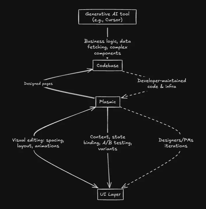
AI tools like Cursor can generate solid scaffolding — layouts, components, logic. But turning that raw code into something polished, branded, interactive, and connected? That’s where Plasmic takes over.
Plasmic lets you take that AI-generated React code and bring it into a visual canvas. You can tweak spacing, reorder sections, bind live data, add animations, A/B test different variants — all without breaking the code behind it. Developers stay in control of the logic and infrastructure, while everyone else gets to iterate fast on the UI layer.
It’s not just a design tool. It’s not just a builder. It’s a collaborative surface that connects code, content, and visual control — no more handoff bottlenecks, no more waiting for a component to get pulled into a sprint.
This is what modern front-end looks like:
- AI to accelerate the starting point.
- Plasmic to refine and extend.
- Codebases that stay clean and flexible.
- Teams that work together instead of tossing files over the wall.
In short, the front-end is no longer just a layer of pixels. It’s the meeting point of humans and machines — and finally, we’ve got tools that respect both sides of that relationship.
So here we are. AI writes our code. Visual platforms like Plasmic let us sculpt and deploy interfaces in real time. The front-end isn’t just code anymore — it’s a system of cooperation between logic, language, visuals, and increasingly, the machine itself.
But what’s funny is that things haven’t really changed.
From Memex to Macintosh to modern-day development stacks, front-end has always been about one thing: making complexity controllable. It’s about giving someone — a user, a customer, a stranger on the internet — a way to do something. To press a button and have the world respond.
We still want that.
Follow @plasmicapp on Twitter for the latest updates.